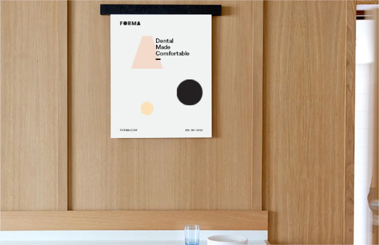
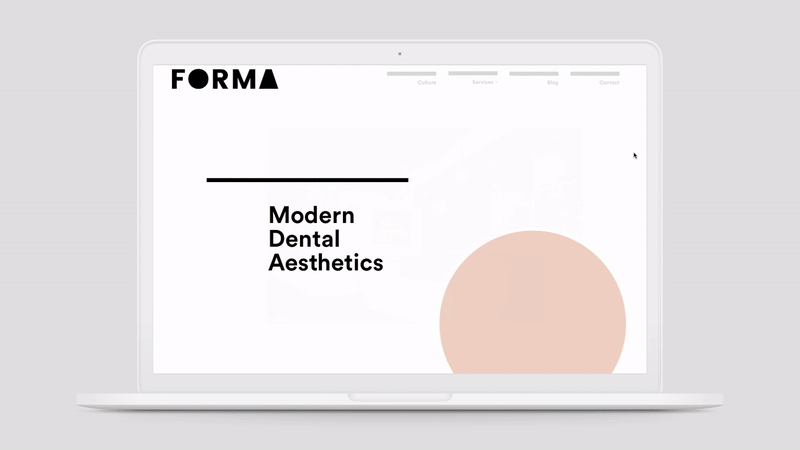
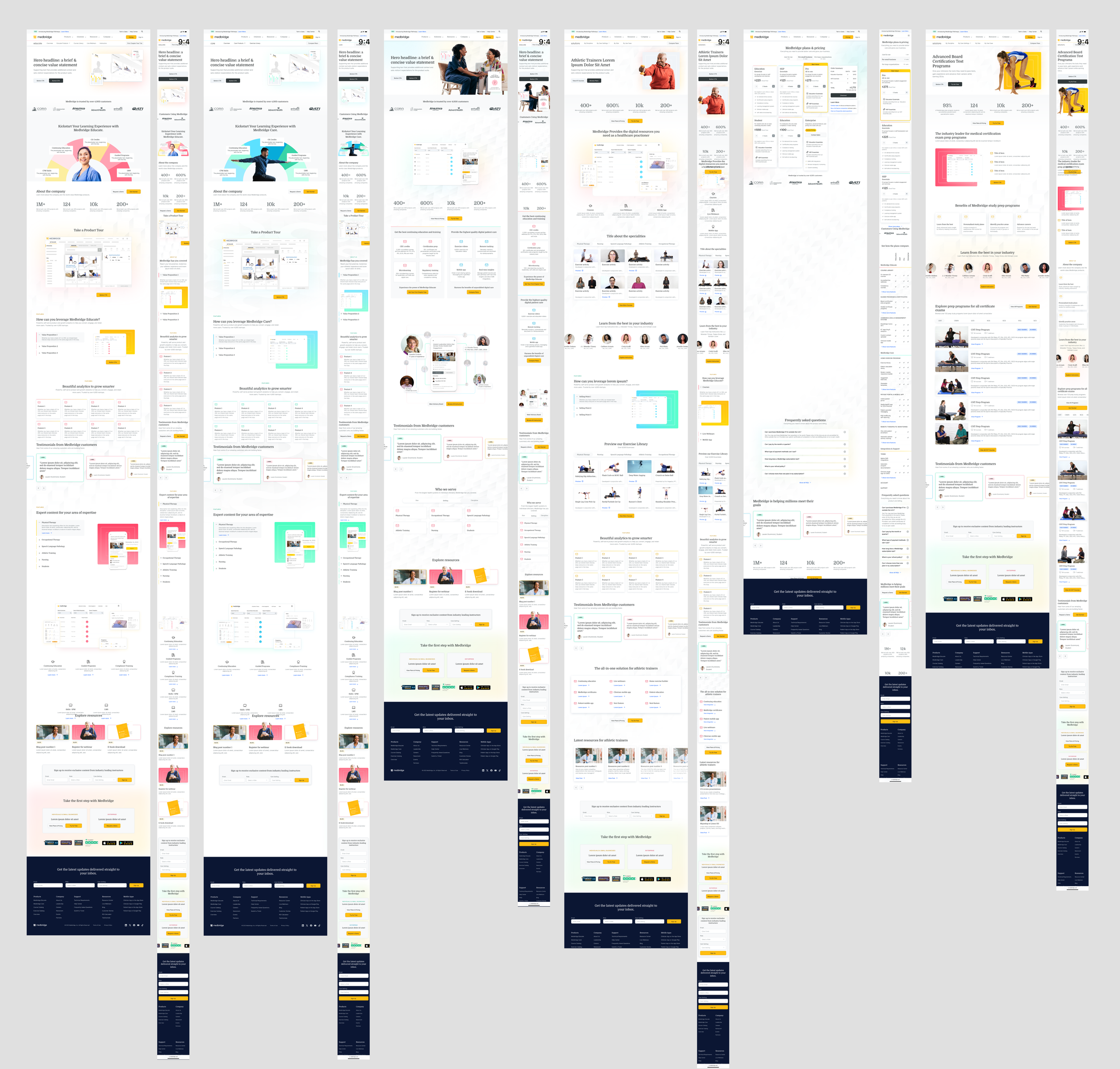
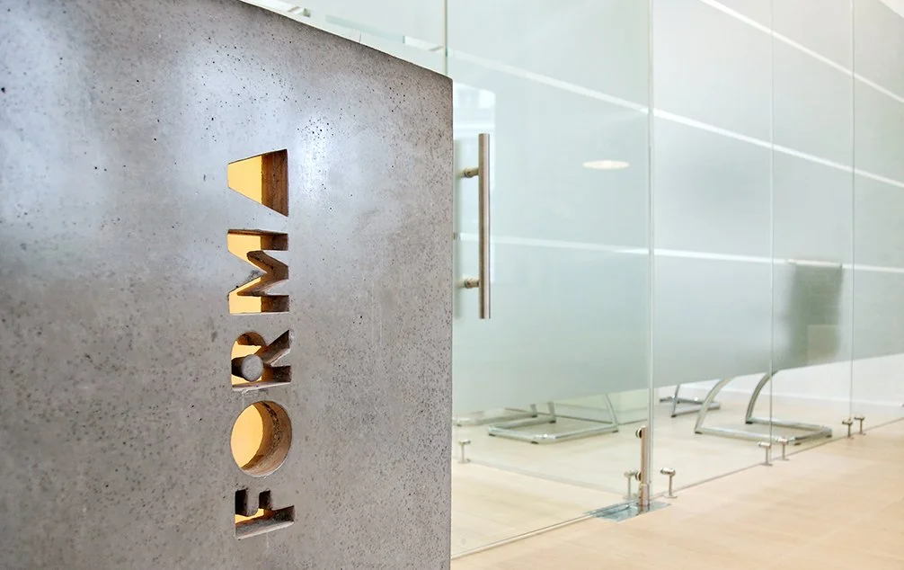
Forma reinvents the perception of the traditional dental office and patient experience. A central part of FORMA is luxurious and well-designed over a traditional dental office. Significant investments have been made in state of the art technology and dental equipment to deliver the highest level of dental care possible. FORMA delivers a high boutique dental experience unlike any other.
Project Goal:
Reestablish the often feared dentist office experience. The client wanted to touch the experience on not only the branding but, everything from the environment of the waiting area to how you are guided through your visit and follow up.
Made in Collaboration with Stilt Media
Naming + Brand Strategy + Branding + Logo Design + Design System + Office design
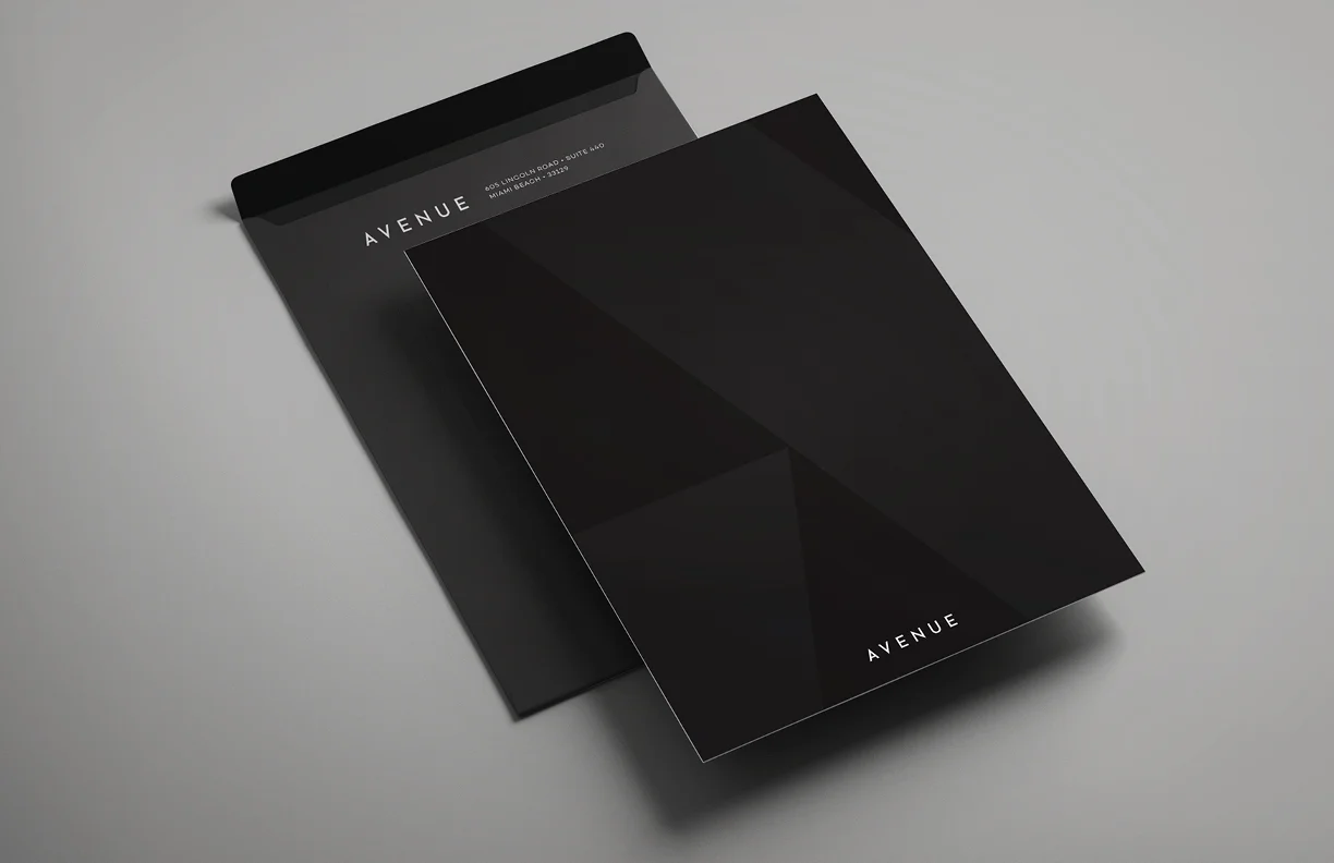
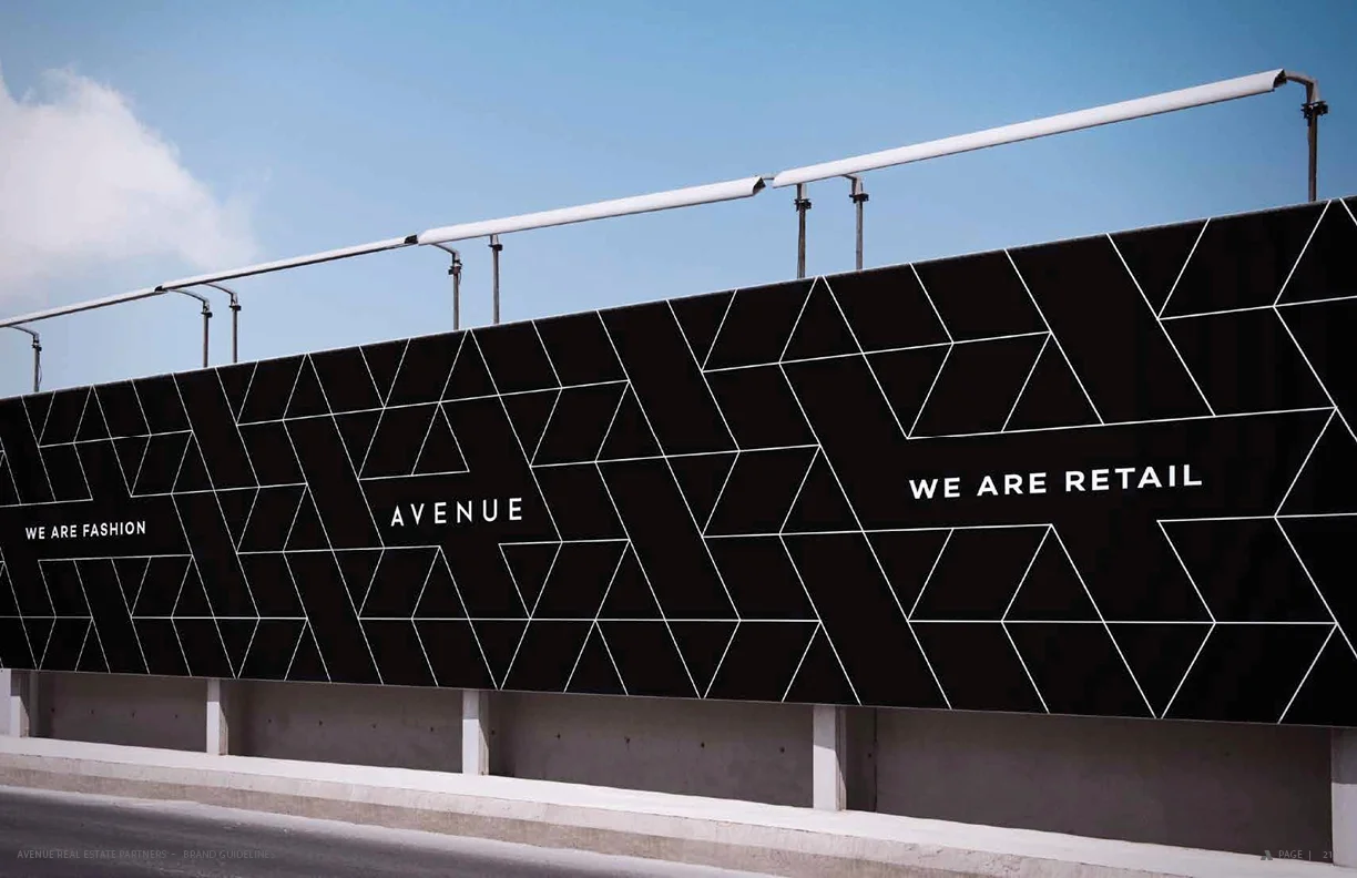
Avenue is an innovative urban retail brokerage company with a focus on retail leasing, investment sales and consulting services. The firm represents property owners, developers, retailers and food and beverage operators. Avenue helps their vision and dreams become reality.
Project Goal:
Create a retail driven real estate brand that would be represented across large developmental businesses in the Miami area. Avenue creates retail space for shopping and offices across Miami. It was important to represent real estate in the brand but, in a unique, clever way.
Made in Collaboration with Stilt Media
Logo Design + Branding + Marketing
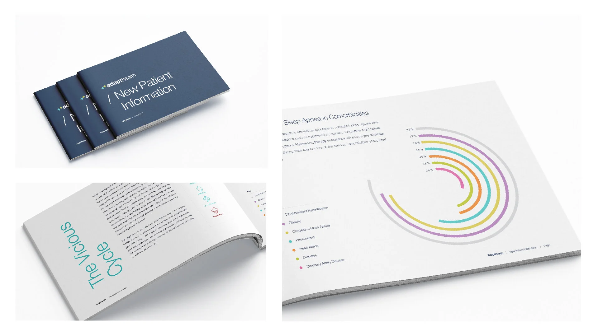
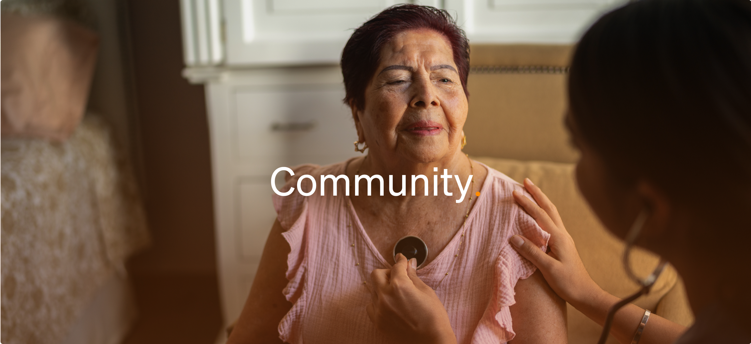
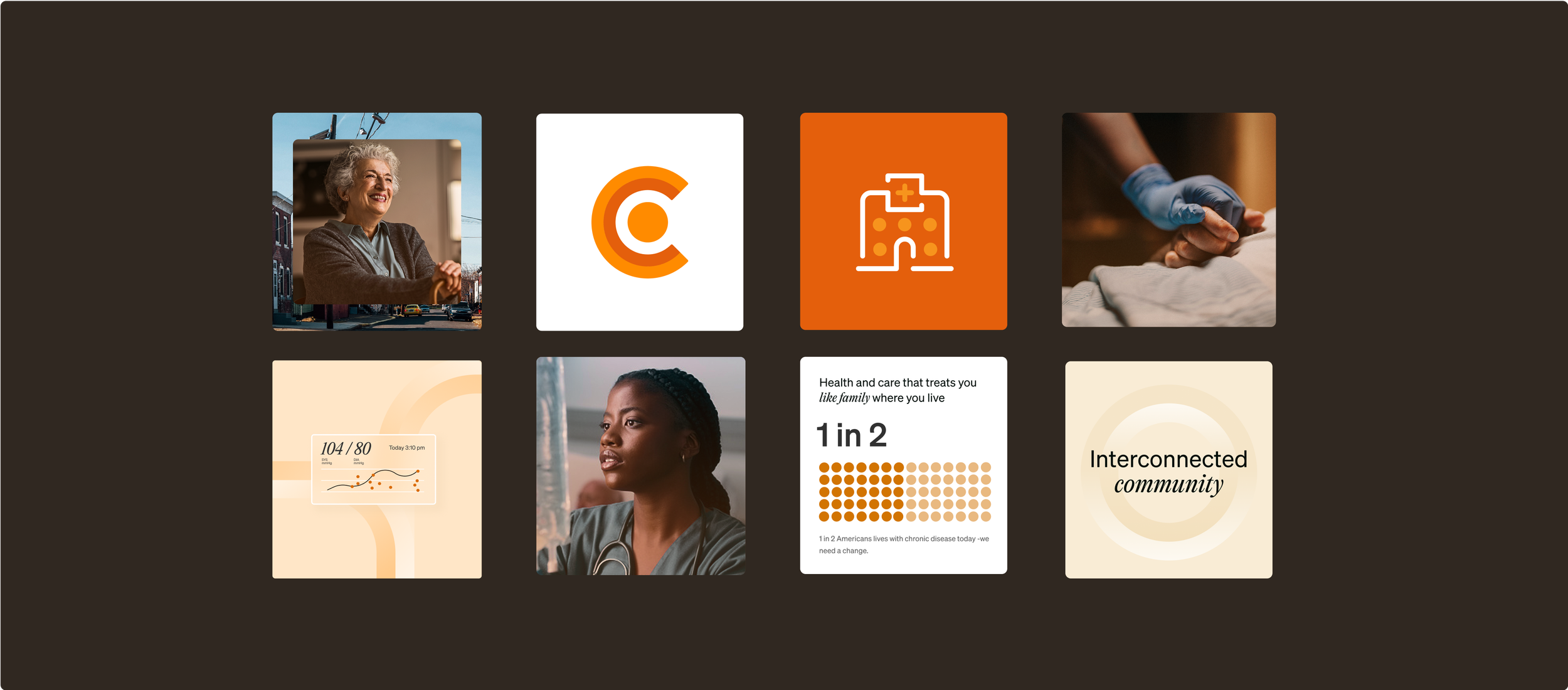
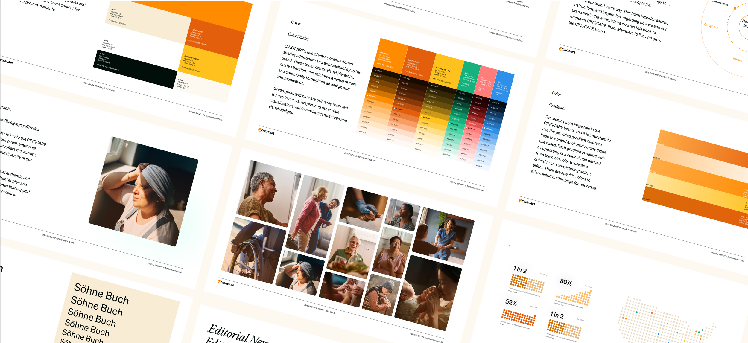
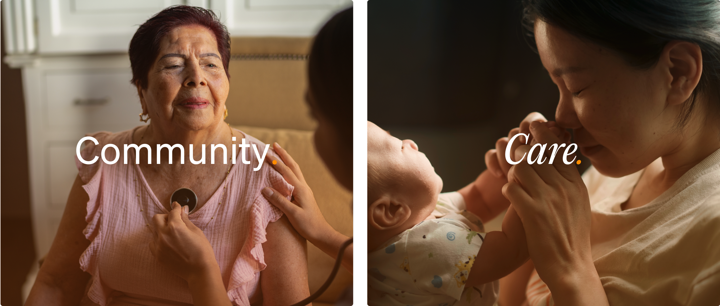
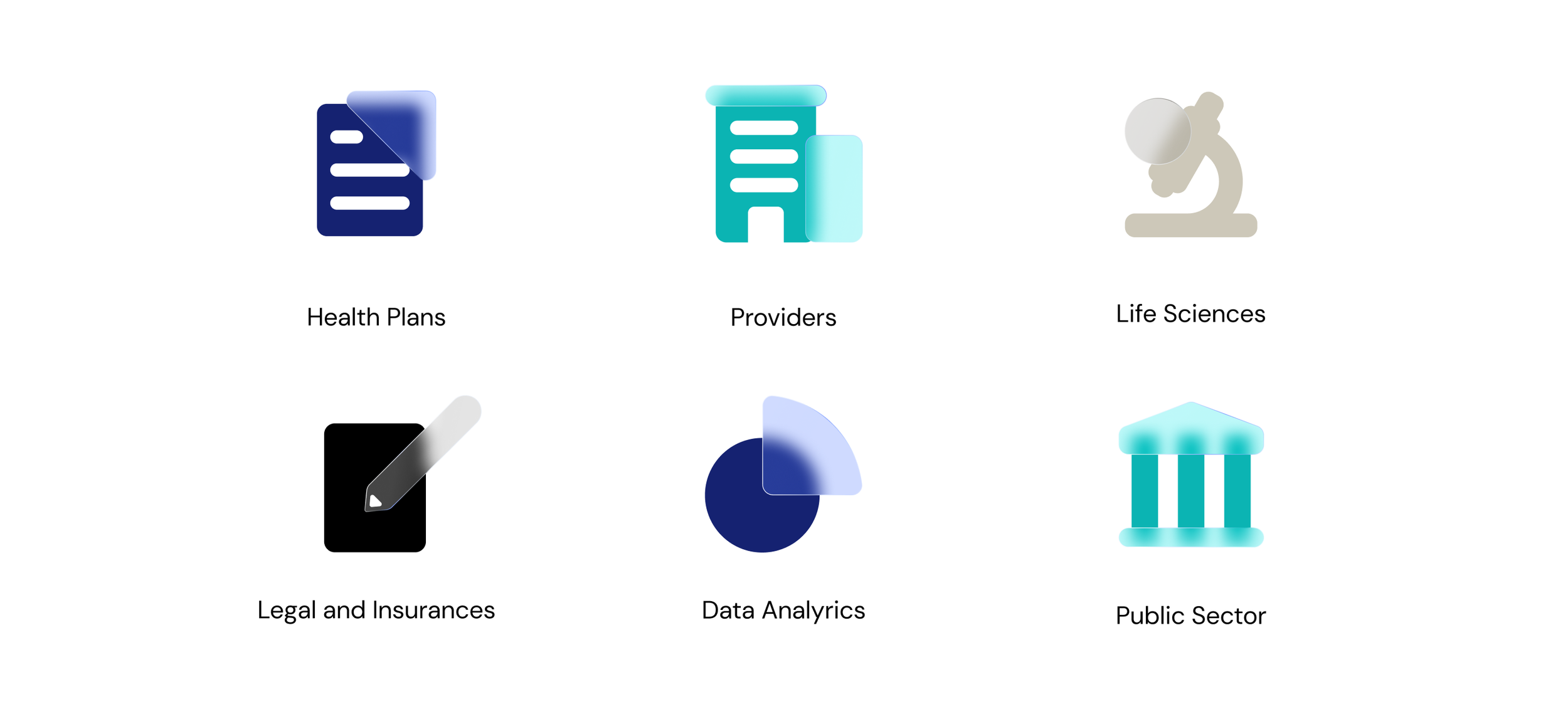
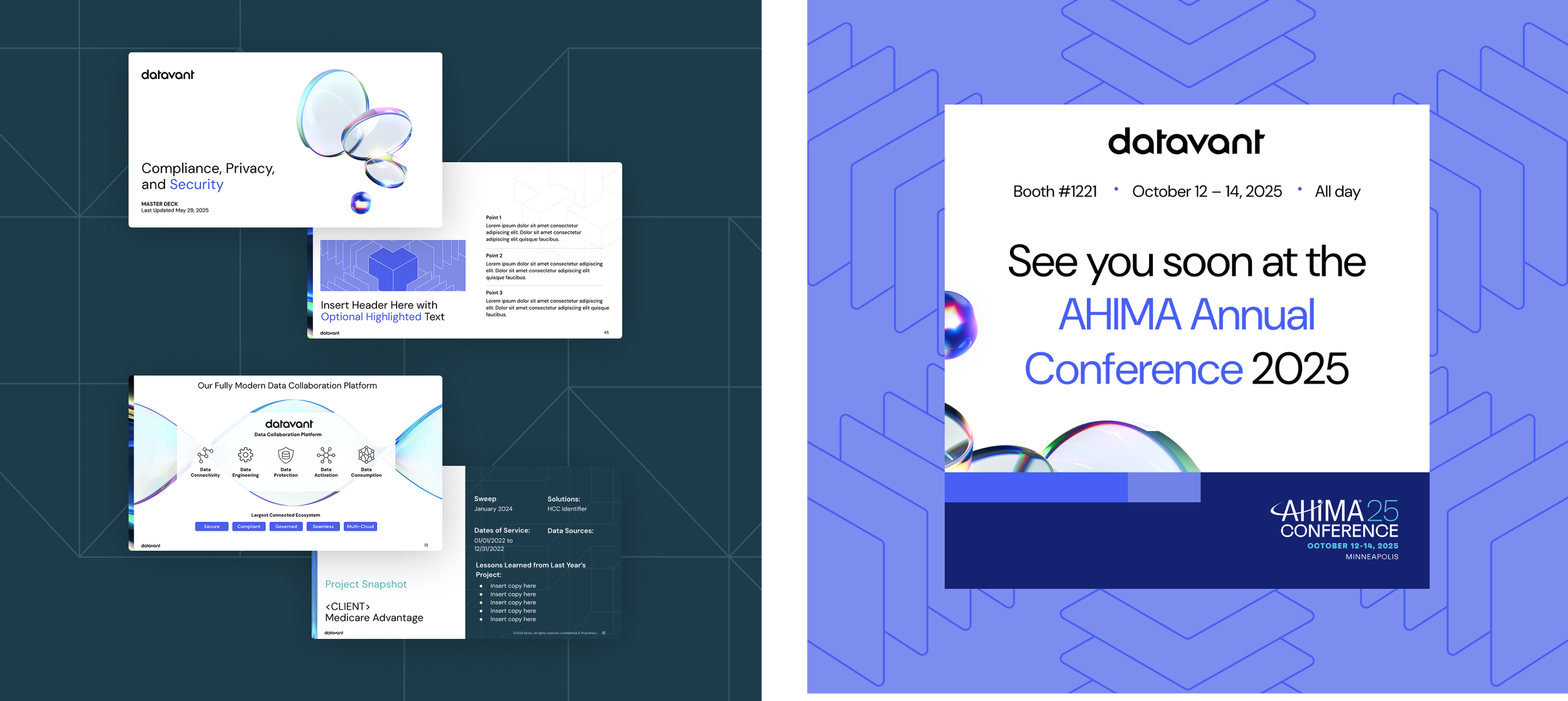
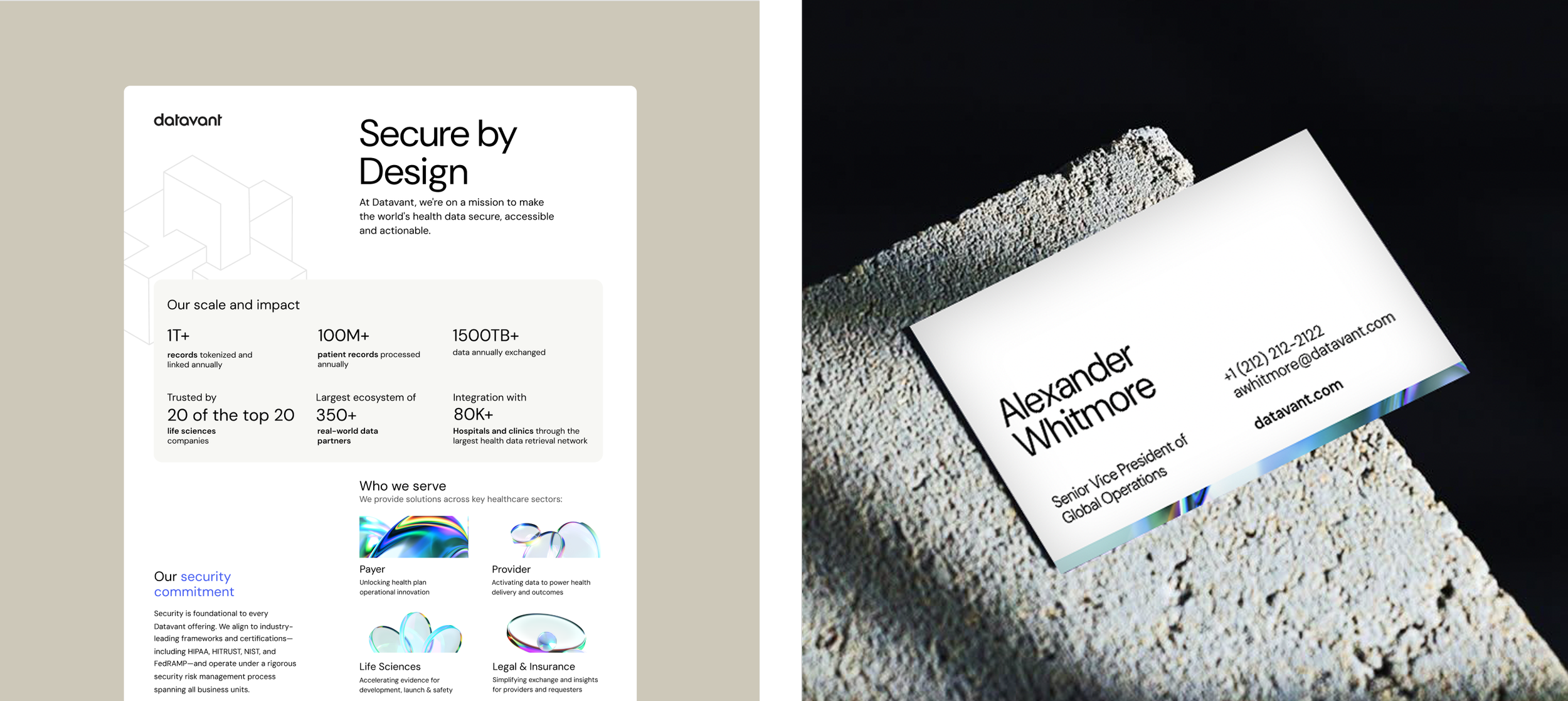
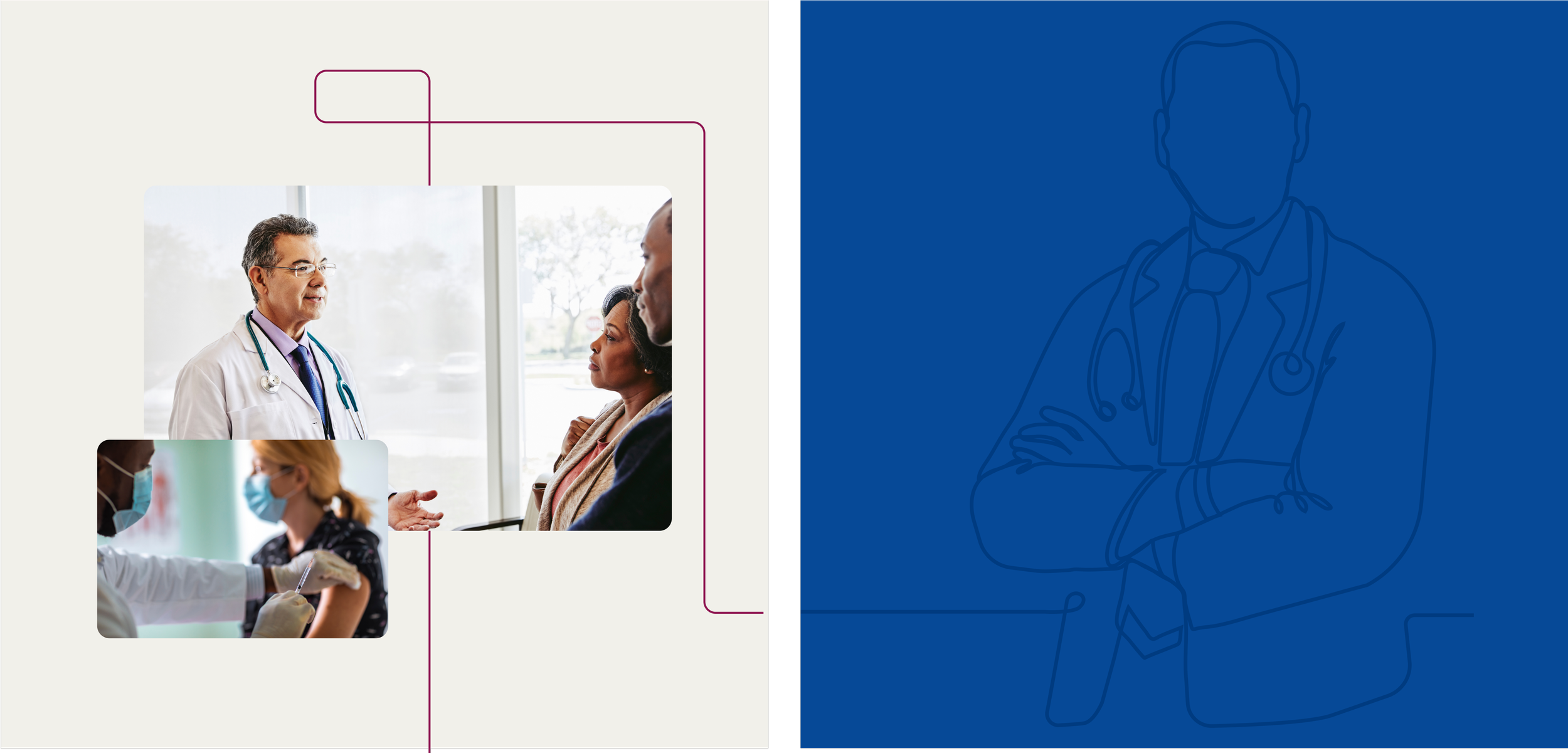
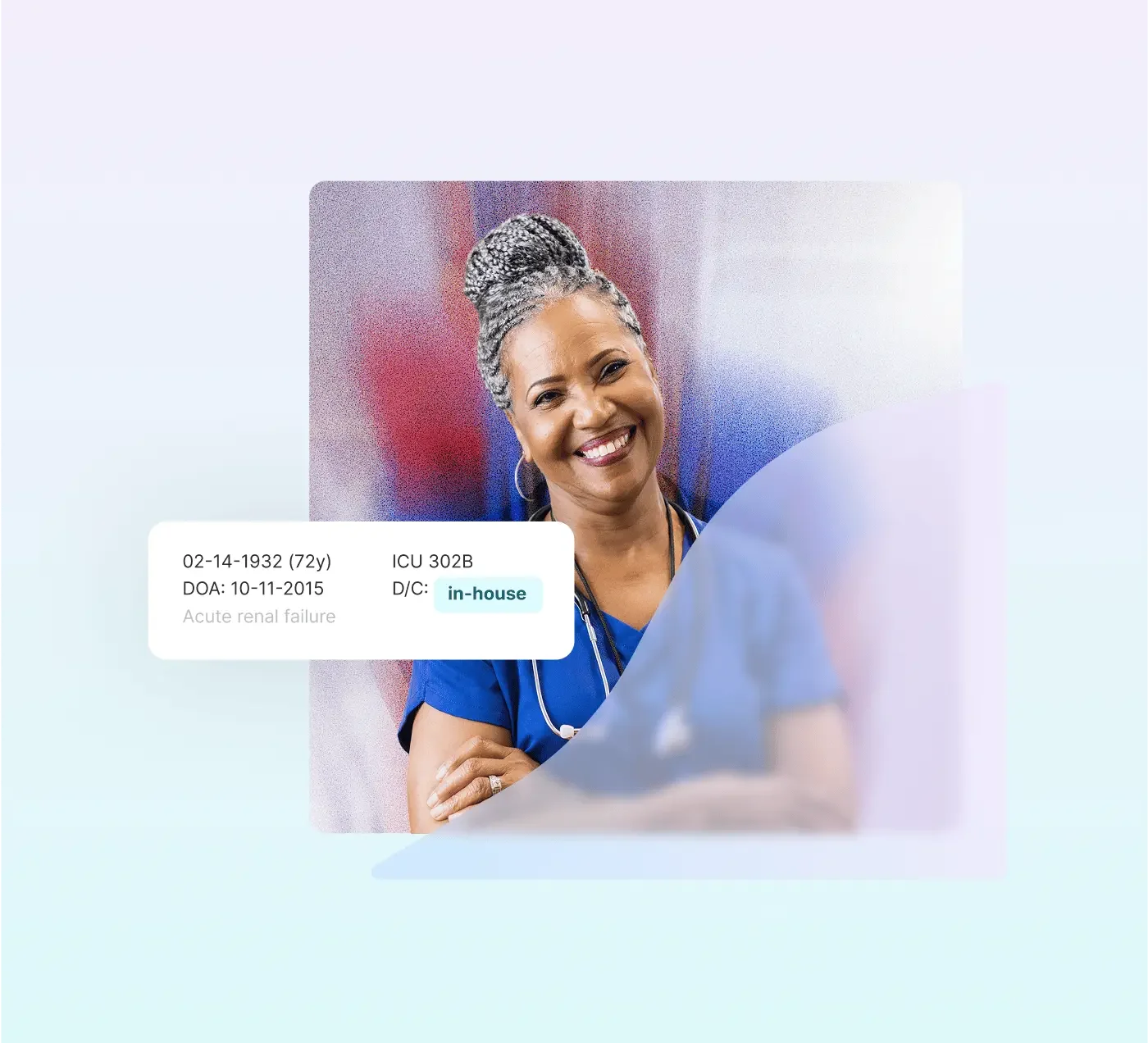
AdaptHealth is a national leader in home medical equipment, connecting patients to the care and supplies they need to transition out of the hospital and into the comfort of their own homes. Operating across 48 states, AdaptHealth serves millions of patients annually across sleep health, respiratory health, diabetes care, and wellness meeting people at some of the most vulnerable moments in their lives.
Project Goal: Hired as the sole brand owner to lead a full company rebrand creating an identity that could compete in a crowded healthcare market while feeling genuinely patient-first. The brand needed to work everywhere: from corporate offices and patient-facing collateral to product packaging, digital, and the website. And as AdaptHealth grew through acquisitions, it needed to scale without losing cohesion.
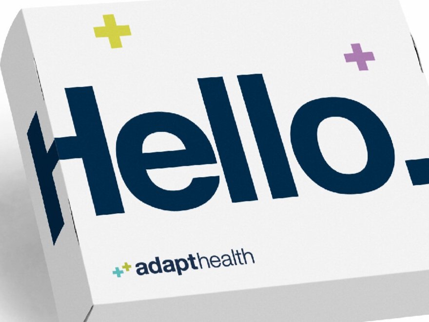
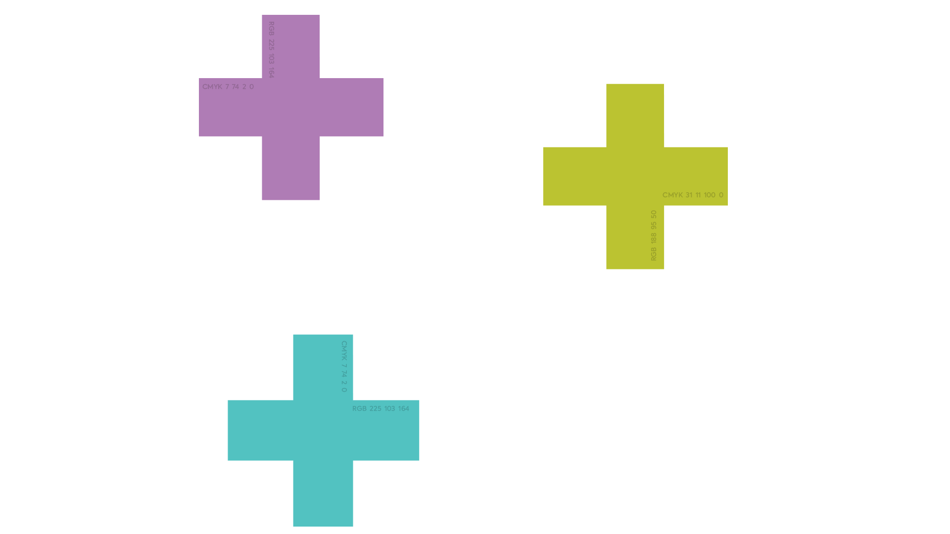
The Story: The work went far beyond a logo. Every touchpoint was considered how a patient would first encounter the brand, how it would feel inside a corporate office, how acquired companies would integrate under the AdaptHealth name. Custom iconography, a clear visual system, and consistent design language were built to make a complex, multi-state organization feel like one unified, trustworthy presence. The goal was simple: in an industry that often feels cold and transactional, make AdaptHealth feel human.
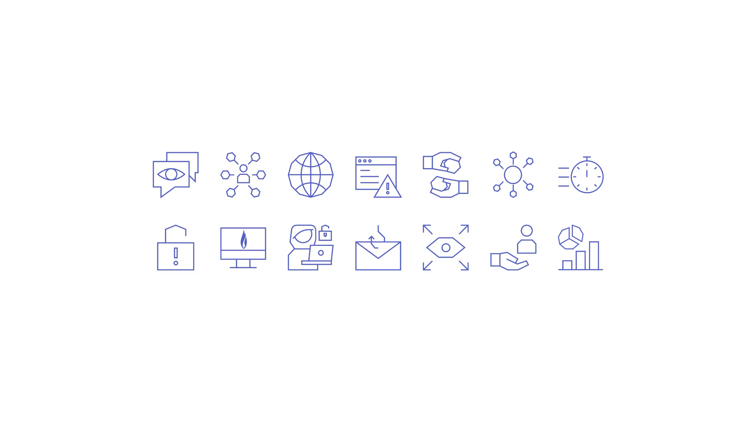
Branding + Logo Design + Collateral + Product Branding + Social Media + Corporate Office Design + Website Design + Custom Iconography + Brand Guidelines
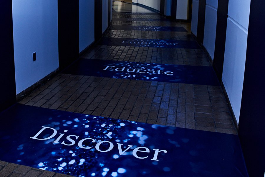
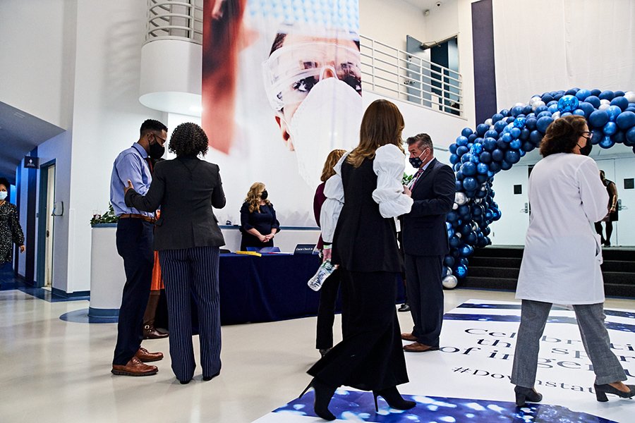
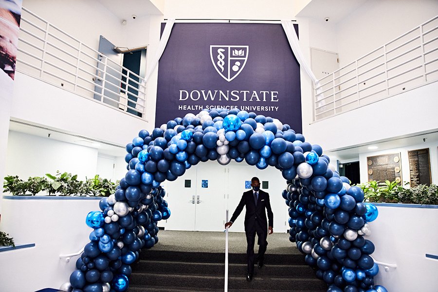
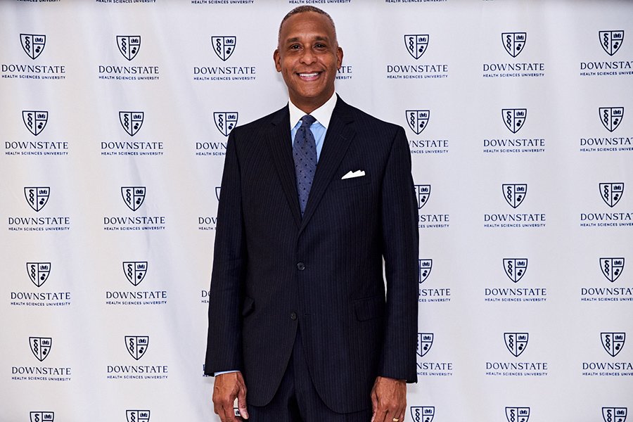
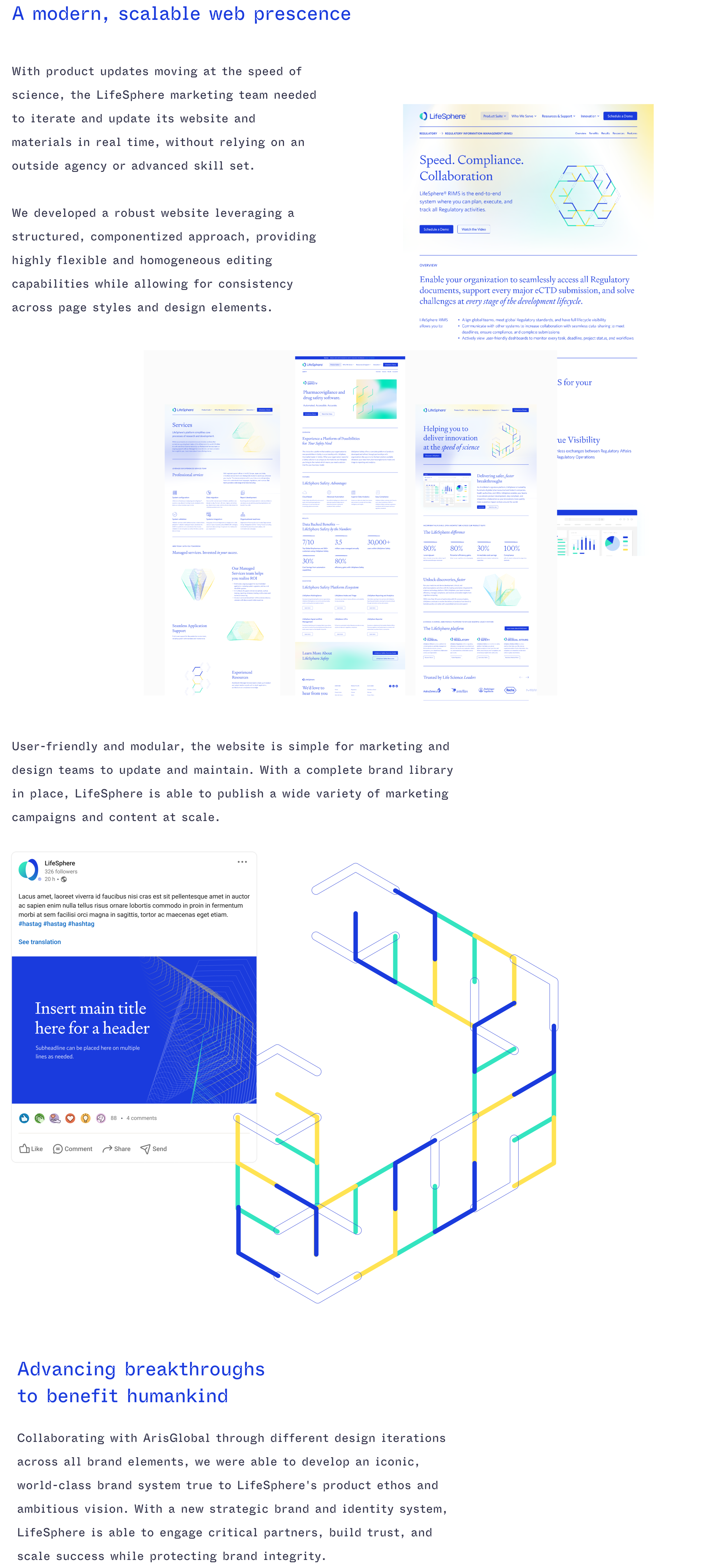
Revitalizing a Pioneering Medical Center and University
Crafted an extensive brand strategy focused on evoking emotion
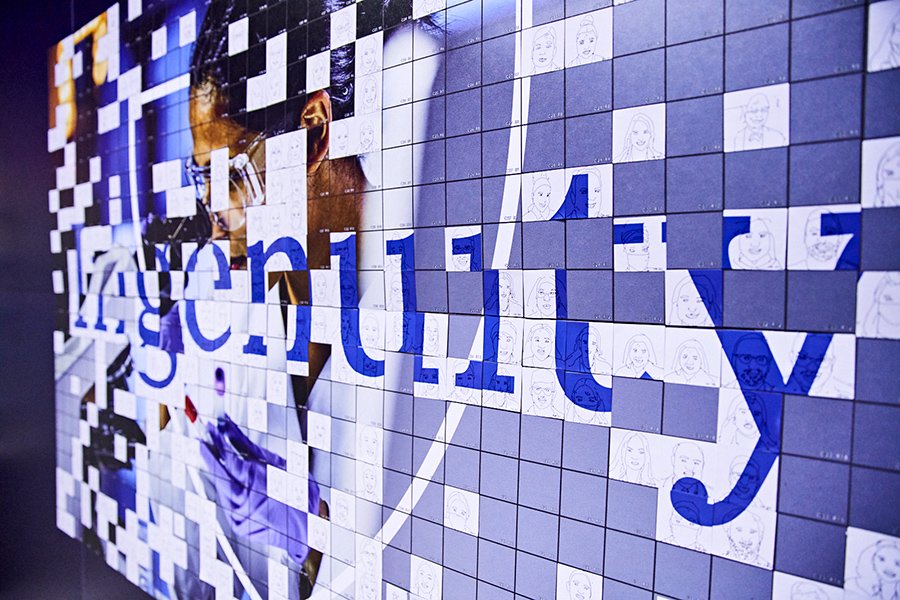
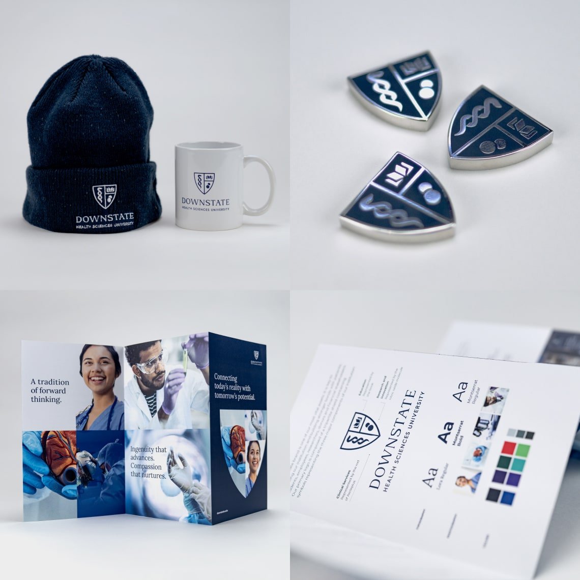
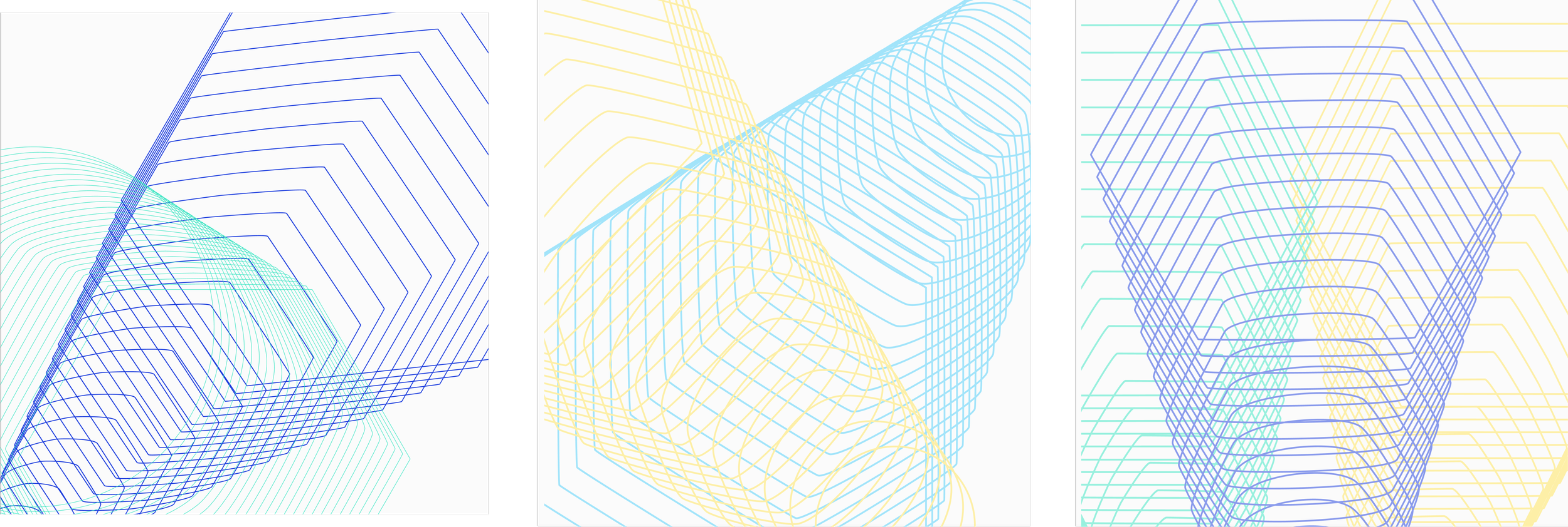
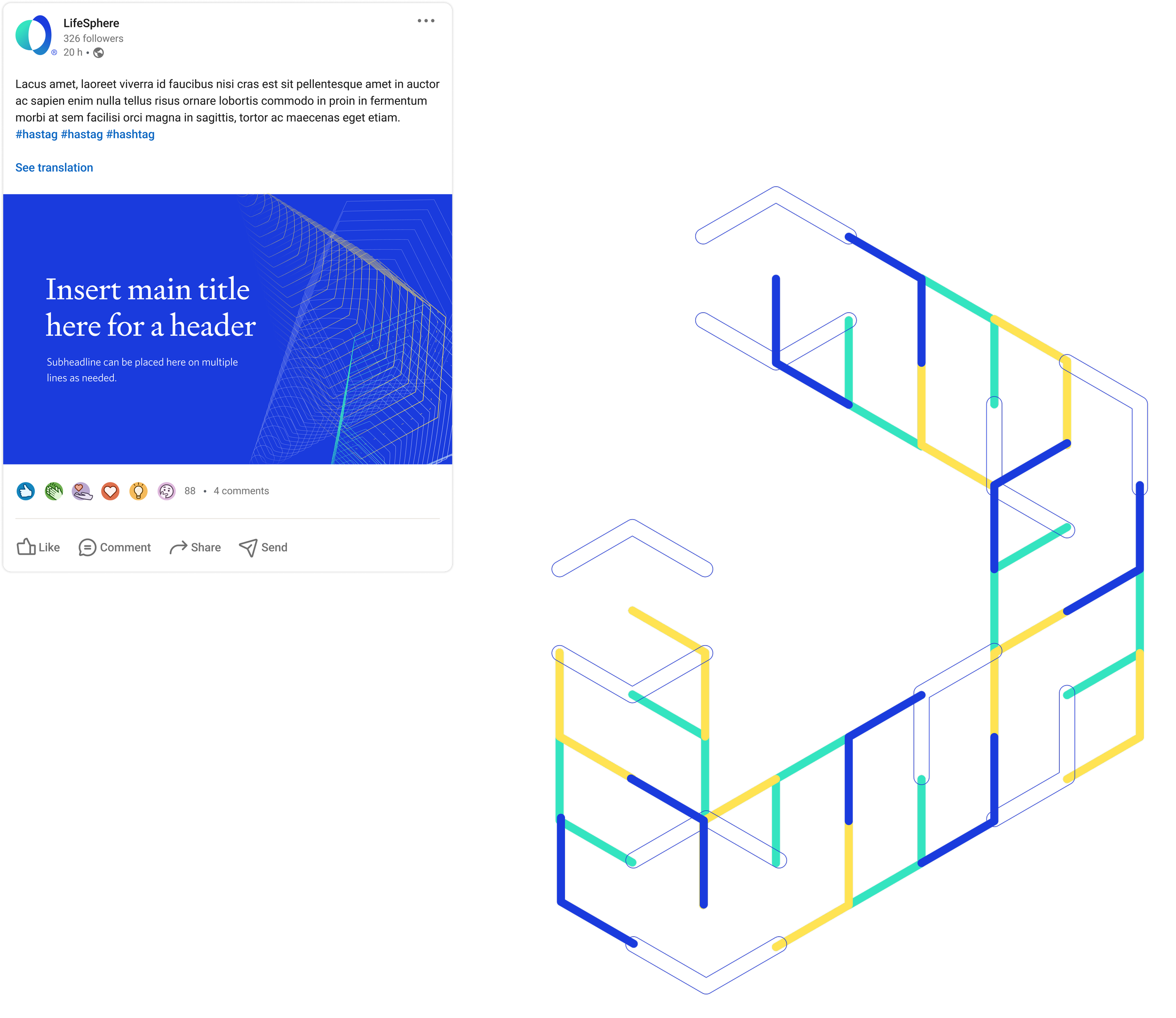
Developed a fresh identity and a captivating visual system
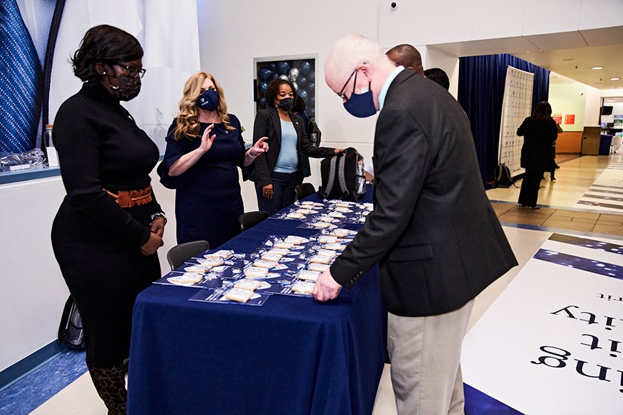
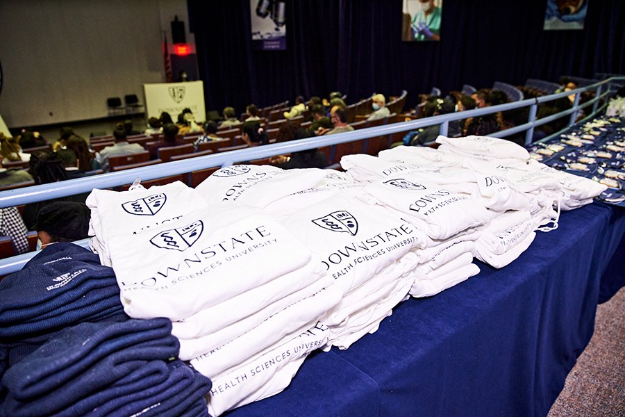
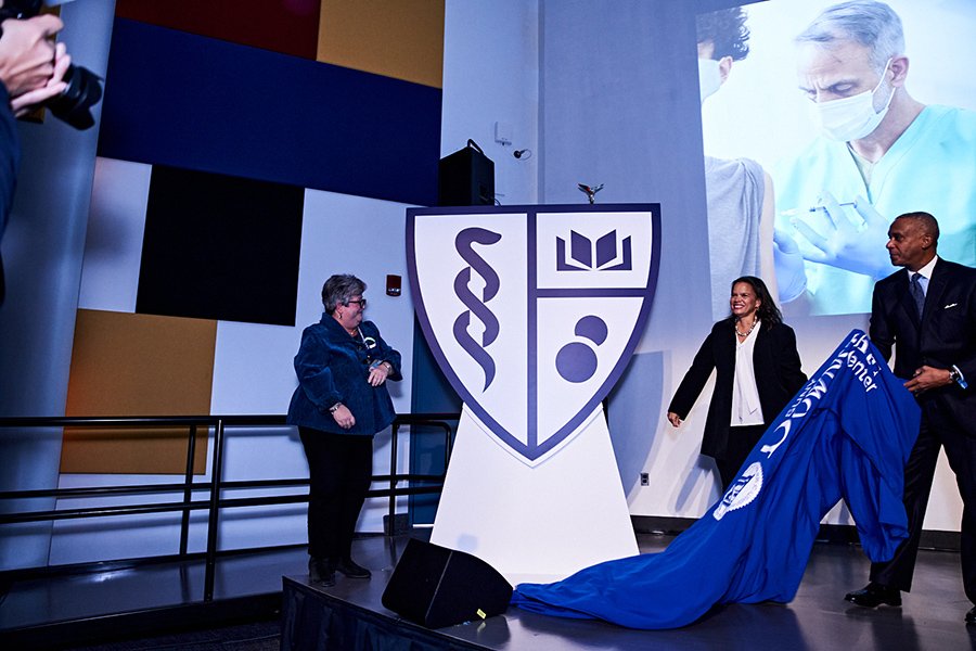
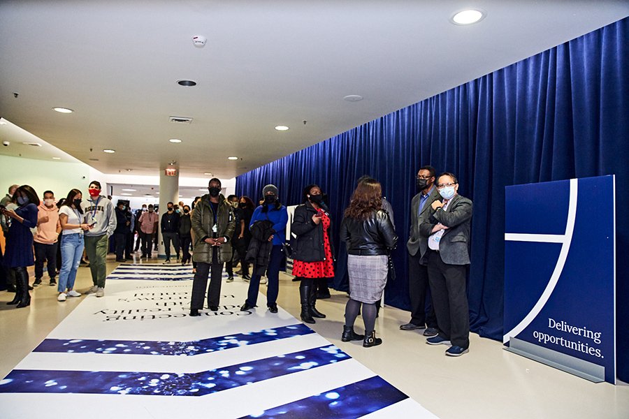
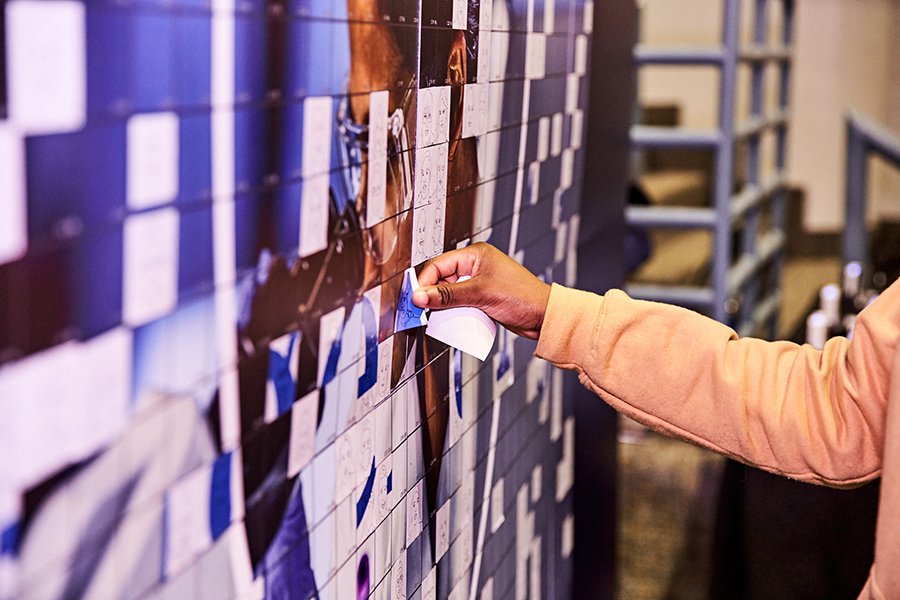
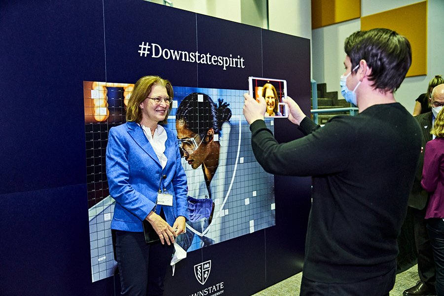
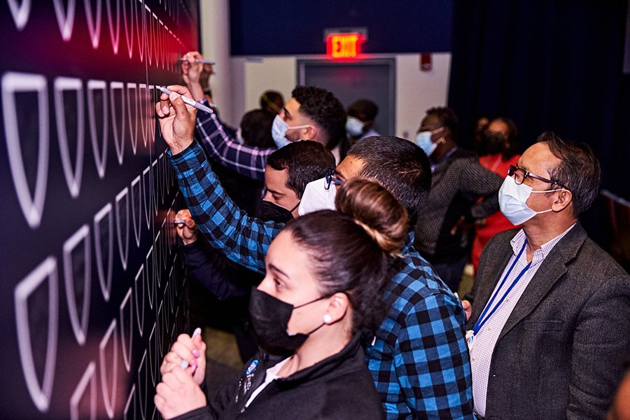
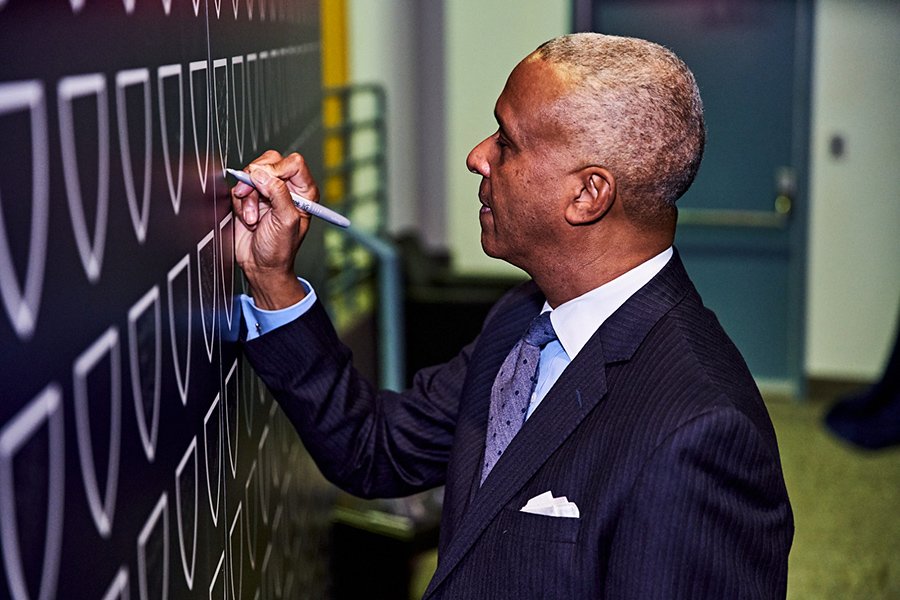
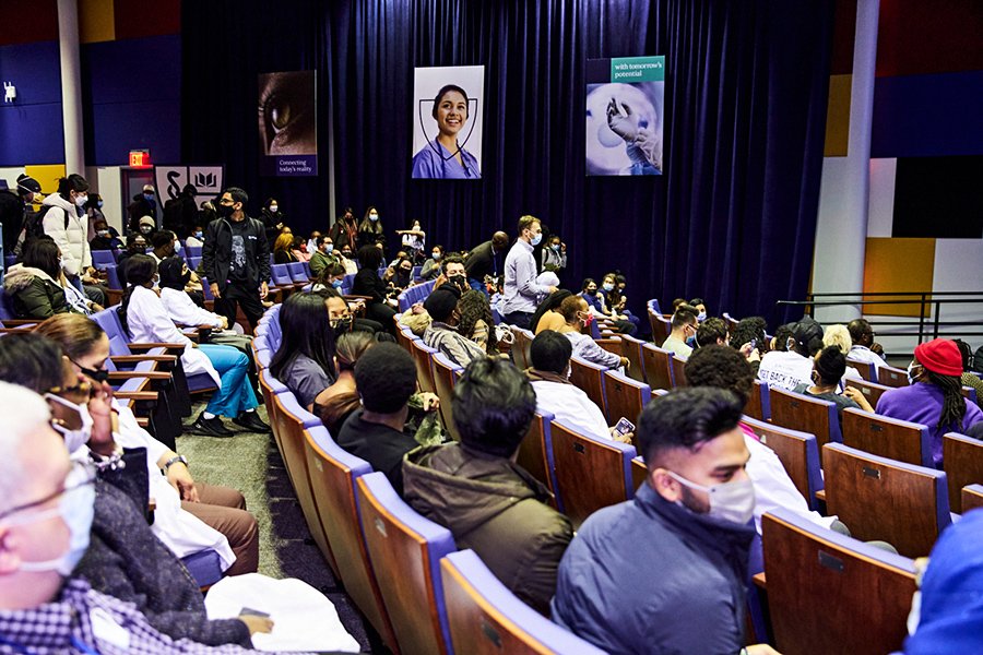
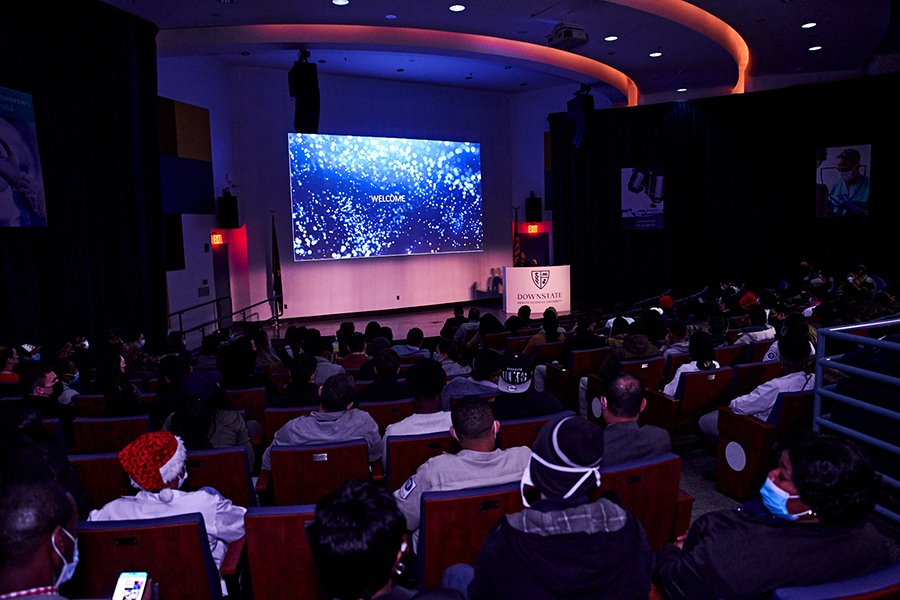
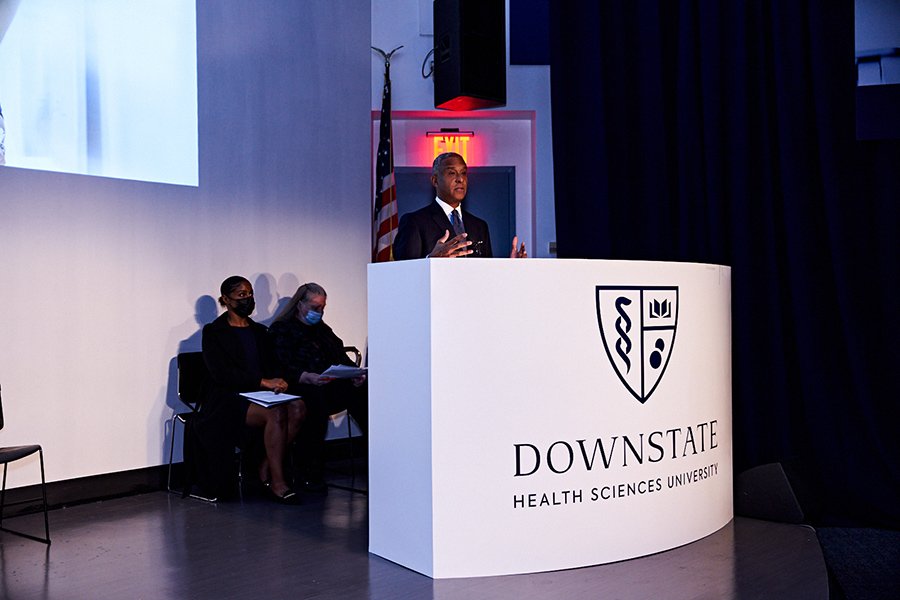
Introduced the brand through a large-scale hybrid event, combining in-person and virtual elements
Launched digital and out-of-home campaigns to enhance brand visibility
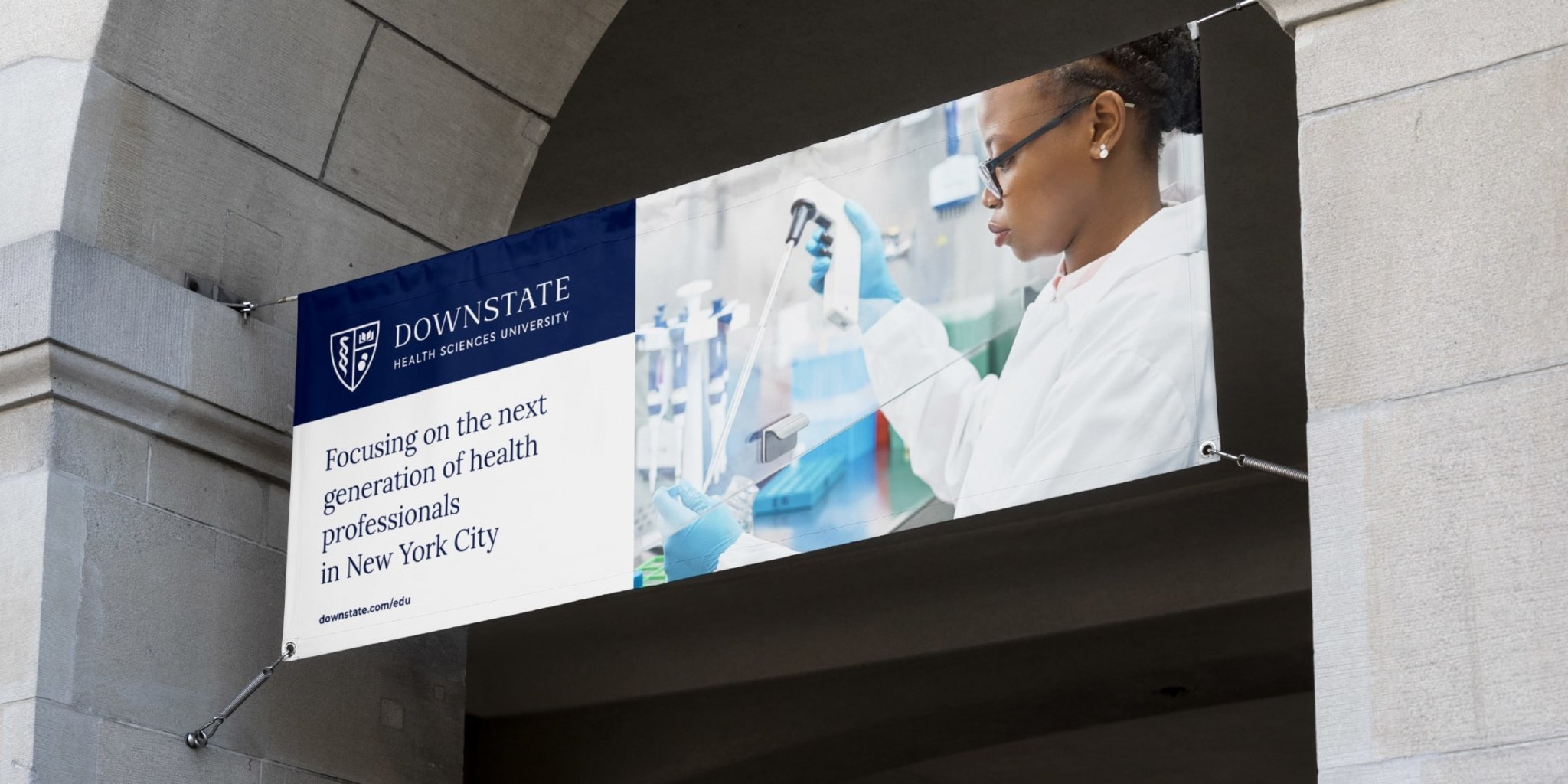
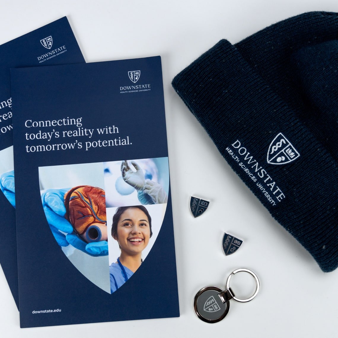
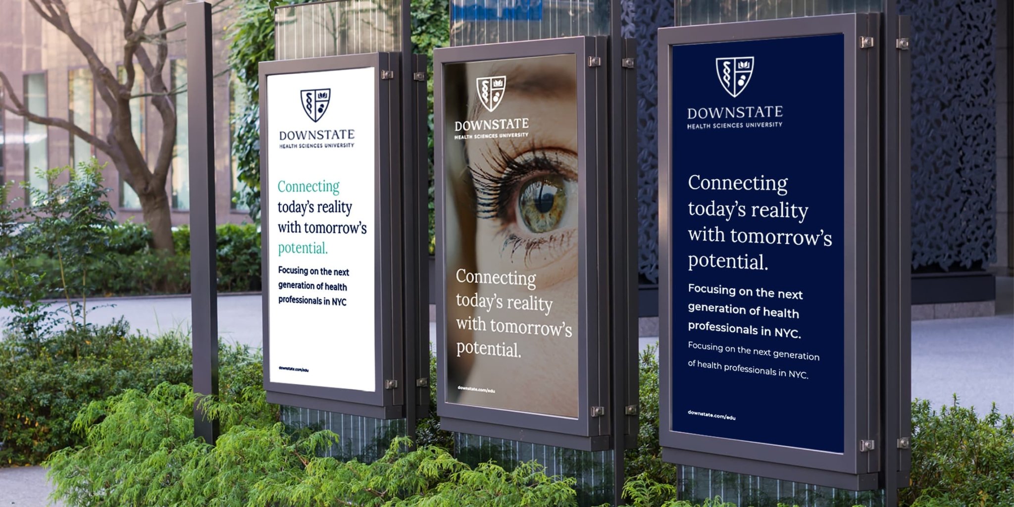
SUNY Downstate Health Sciences University, a renowned medical institution in New York, boasts a rich history of training more doctors in New York City than any other medical college. Established in 1860, the university has evolved from a single medical school to encompass five colleges, a teaching hospital, and a dynamic research and biotech hub. Seeking to rejuvenate its brand, align with its expanded offerings, and foster greater engagement among stakeholders, Downstate embarked on a comprehensive branding initiative.
In collaboration services with MBLM
Research & Insights + Brand Strategy + Brand Architecture + Brand Identity + Design Systems + Brand Management + Messaging + Campaigns + Social Media + Brand Launch + Presentations + Events & Environments
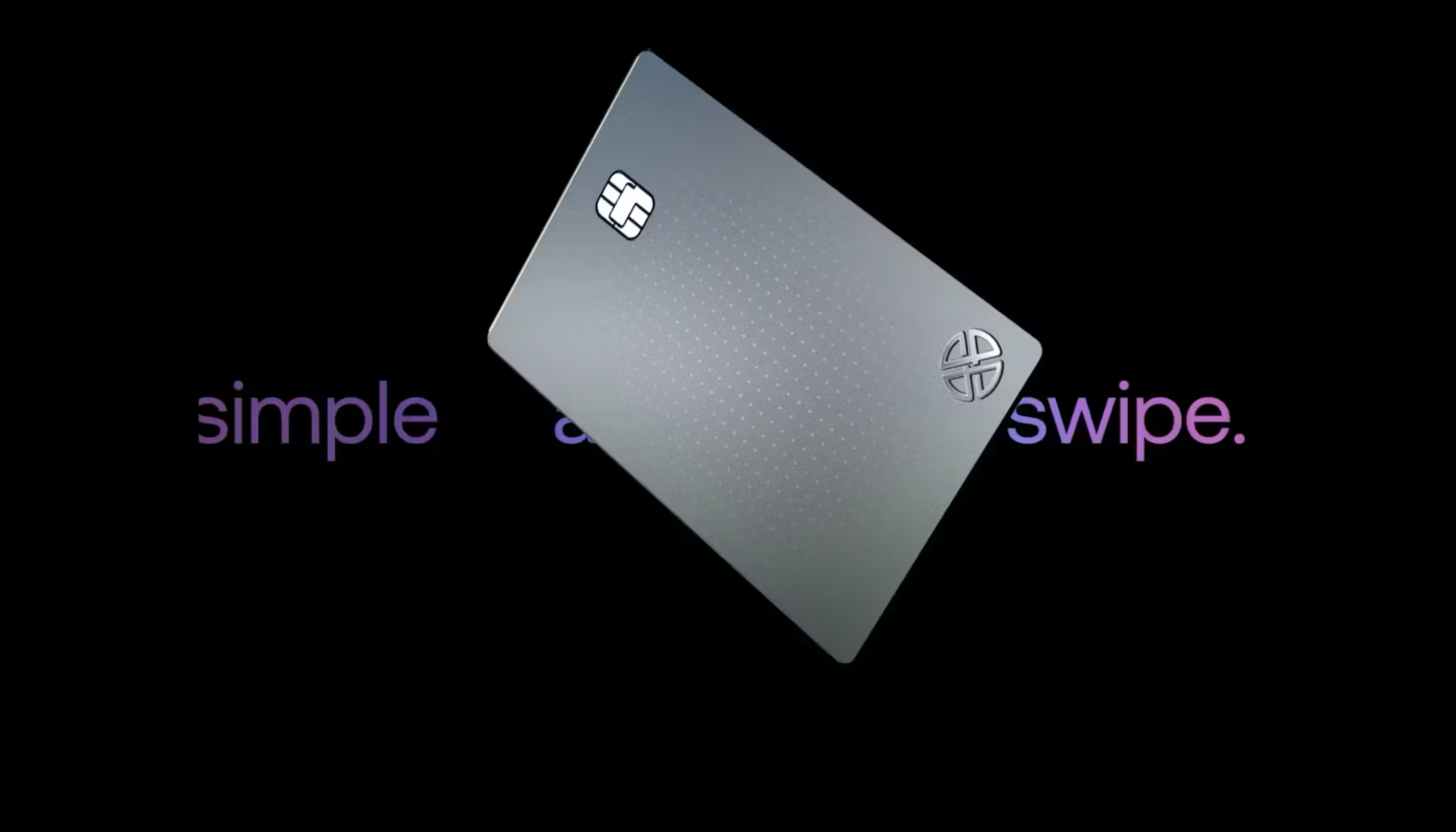
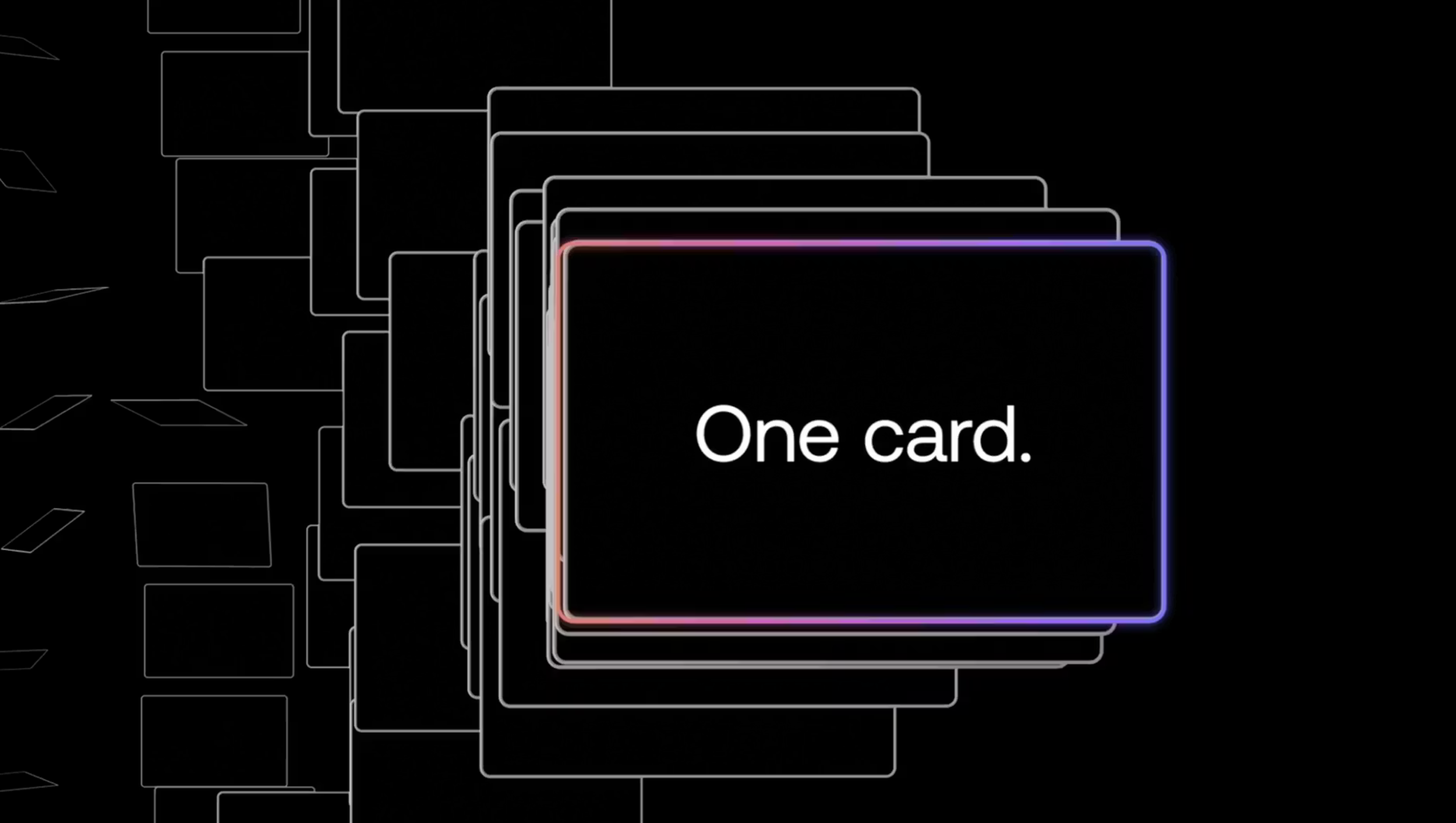
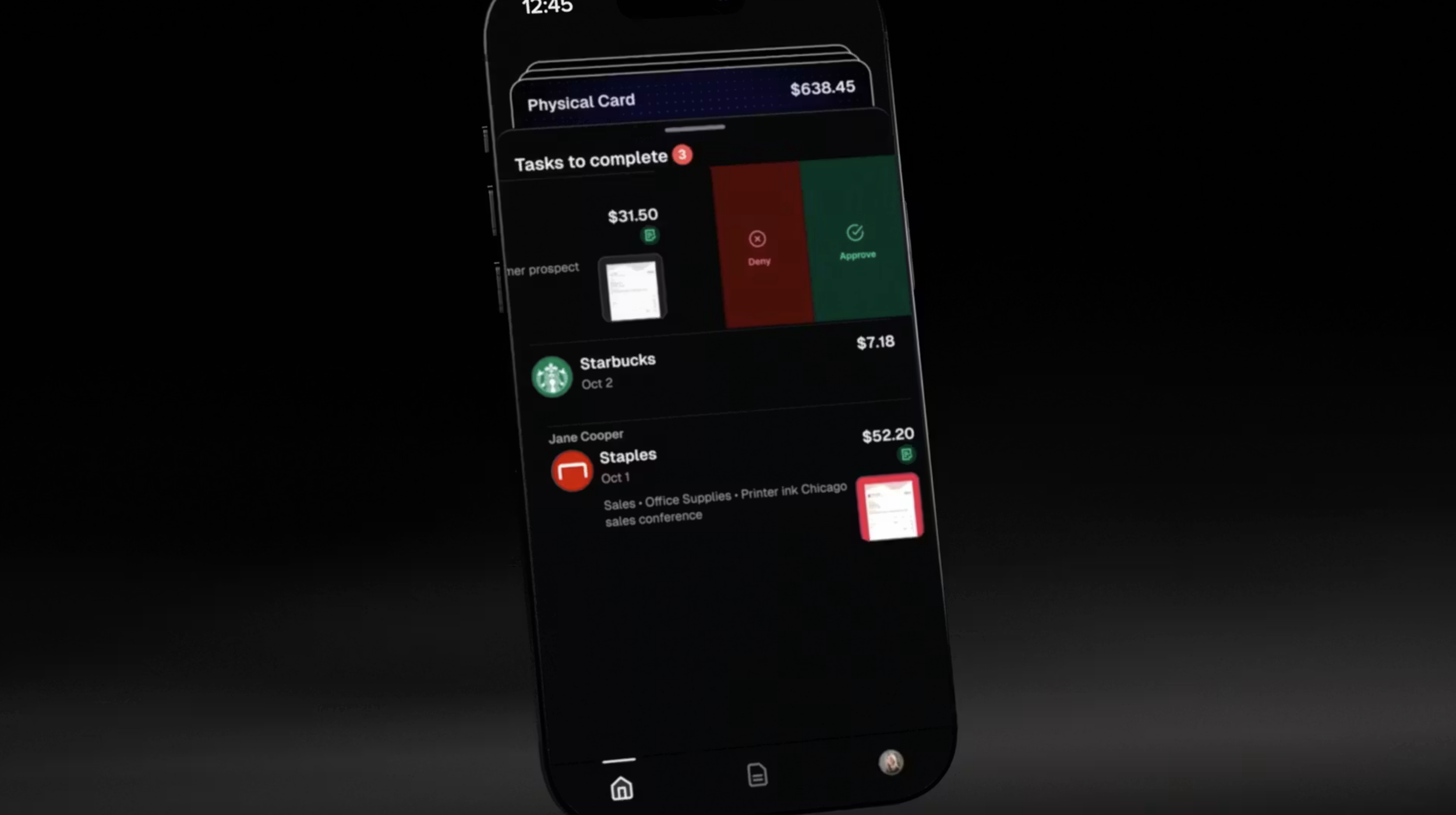
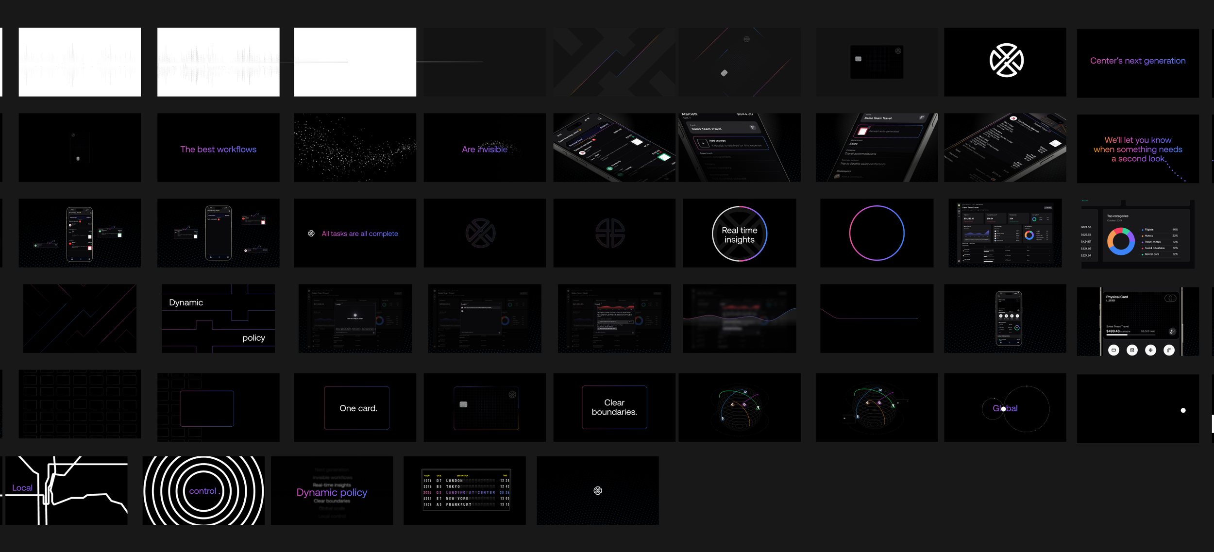
Center is a modern travel and expense management platform built to give companies real-time visibility and control over spending. As they prepared to launch a fully reimagined product experience, they needed more than a demo — they needed a story.
Project Goal: Create a high-impact launch video that could build excitement internally, resonate with investors, and set the stage for Center's next chapter all in 3.5 weeks, working solely from Figma screens of the new platform.
The Story: The storyboard was the foundation. Working closely with the motion designer, I mapped the narrative arc — how the visuals would move, what the pacing would feel like, and how the animated UI could hint at the platform's power without revealing too much too soon. The result was a cinematic teaser that felt more like a brand moment than a product walkthrough. Clean, confident, and built for a room full of people who needed to believe in what was coming.
The video became a key asset in Center's internal launch and investor conversations and launched just a few months before the company was acquired by American Express.
Made in Collaboration with Blinkpath
Brand Storytelling + Storyboard Direction + Motion Design Collaboration + Animated UI
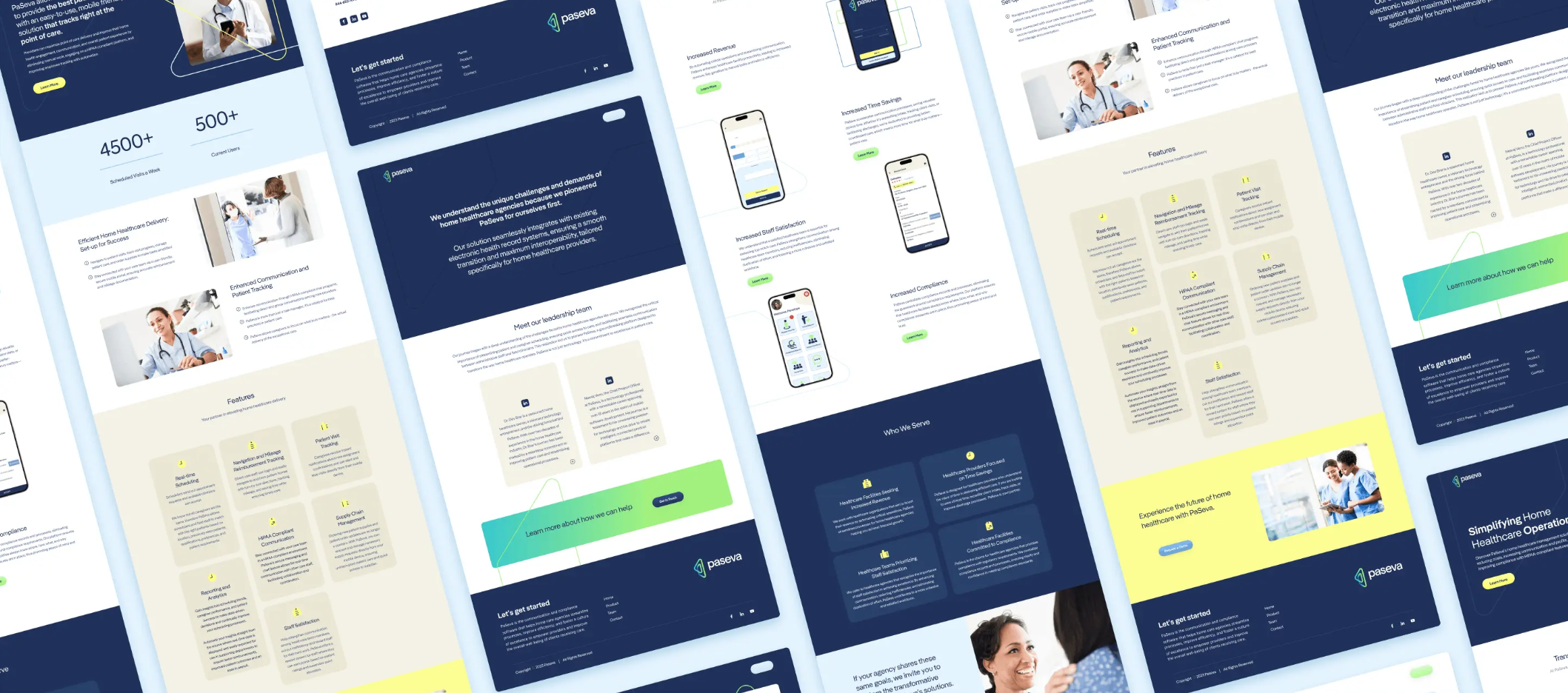
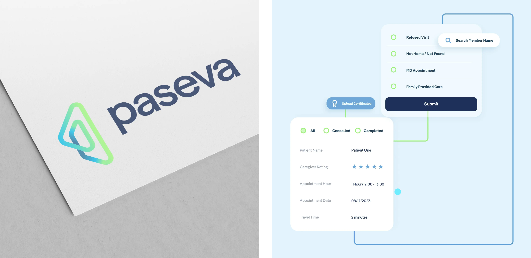
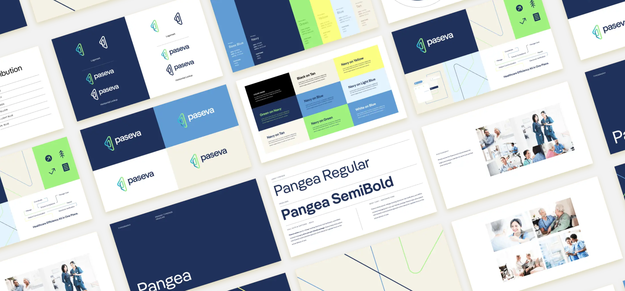
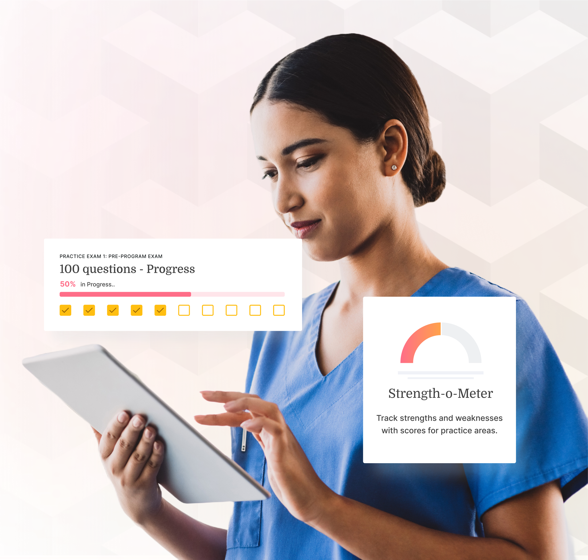
PaSeva is a home healthcare management platform built to simplify the way caregivers, patients, and providers stay connected one place to keep everything for the people you care for.
Project Goal:
Design a brand identity that could carry PaSeva into their market launch and signal innovation without losing the trust and warmth essential in healthcare. The logo needed to do the heavy lifting telling the story of a single, unified place where everything comes together for the patient and caregiver.
Logo: The mark was designed around the idea of oneness one platform, one place, one source of truth for home healthcare management. Clean geometry and considered negative space reflect clarity in a complex industry, while the form suggests both connection and containment the feeling of everything being held in one place. The color palette pairs cool blues with energizing greens, balancing trust and approachability with a sense of forward momentum.
Made in Collaboration with Atomic Health
Branding + Logo Design + Brand System + Color + Typography + Website
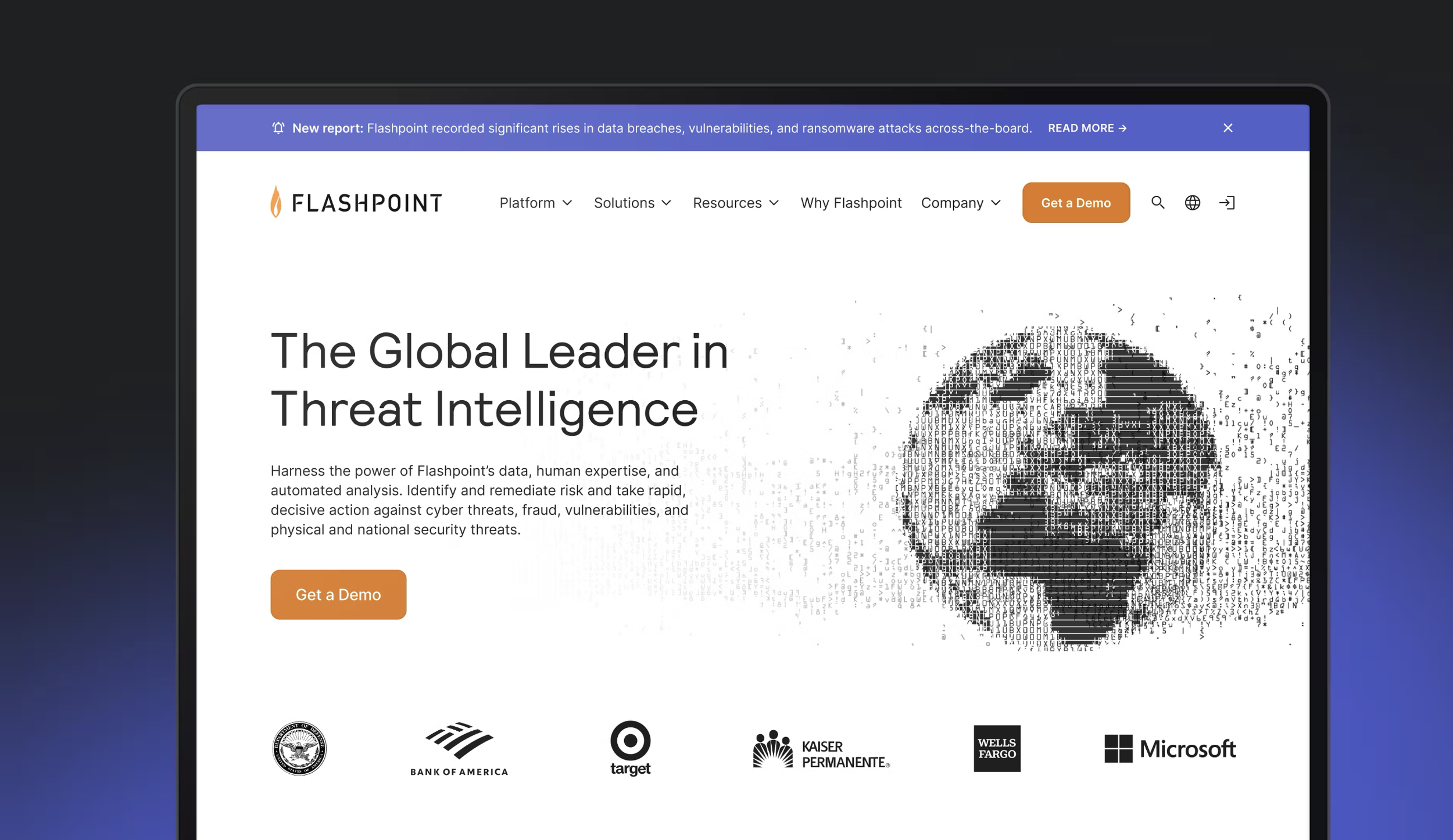
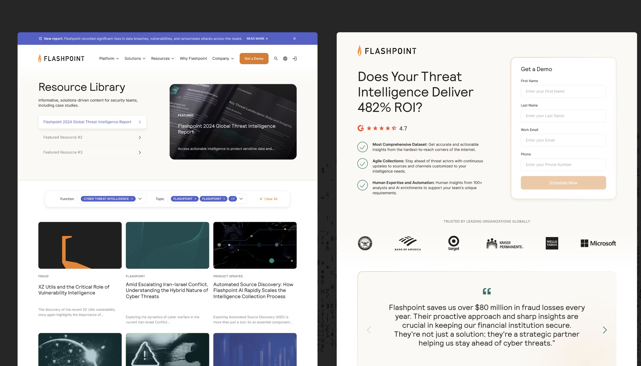
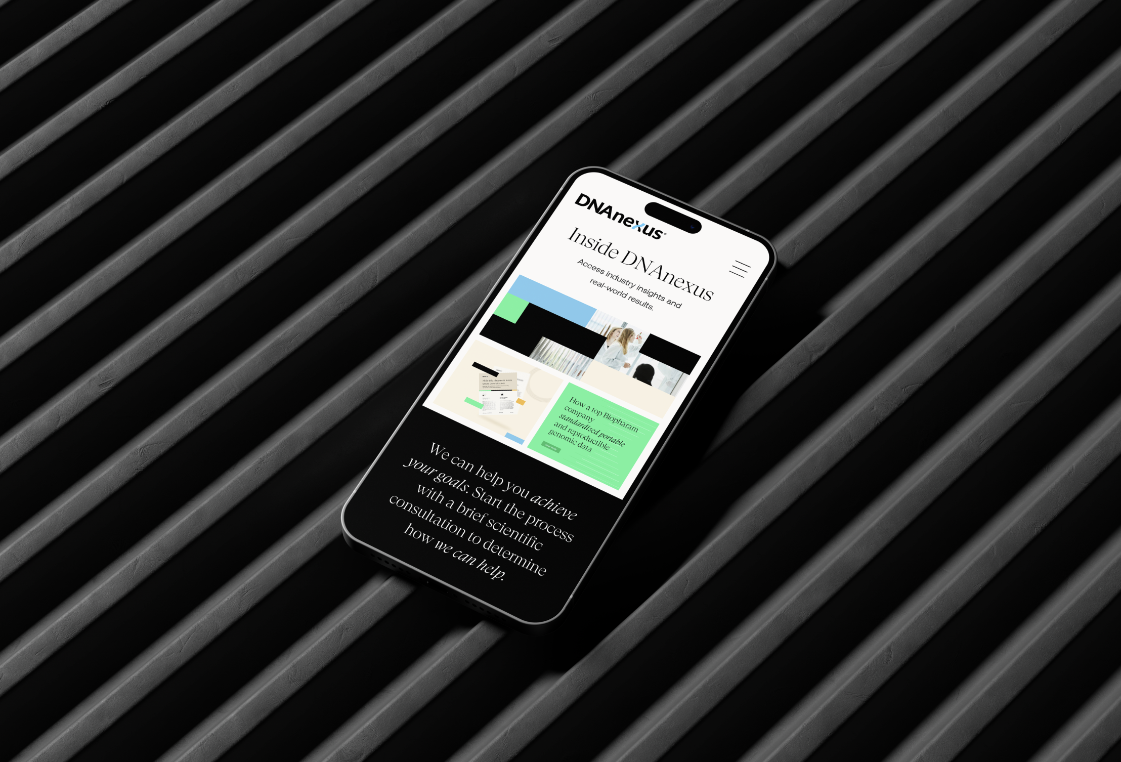
Flashpoint delivers advanced threat intelligence to security teams at global organizations — giving them the insights they need to stay ahead of risk.
Project Goal: Elevate Flashpoint's visual identity and web presence to match the sophistication of their platform — without the disruption of a full rebrand.
The Story: Flashpoint hadn't outgrown their brand dramatically — they'd simply evolved past it. We explored multiple creative directions and landed on a refined visual expression: a more considered approach to color, typography, and graphic language that felt distinctly them. Applied across key brand elements and a redesigned website, the result was a brand that finally matched the company behind it.
Made in Collaboration with Atomic Health
Brand Refresh + Visual Identity + Color + Typography + Graphic System + Website Design
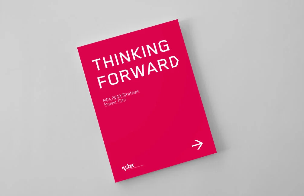
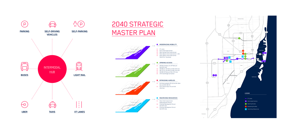
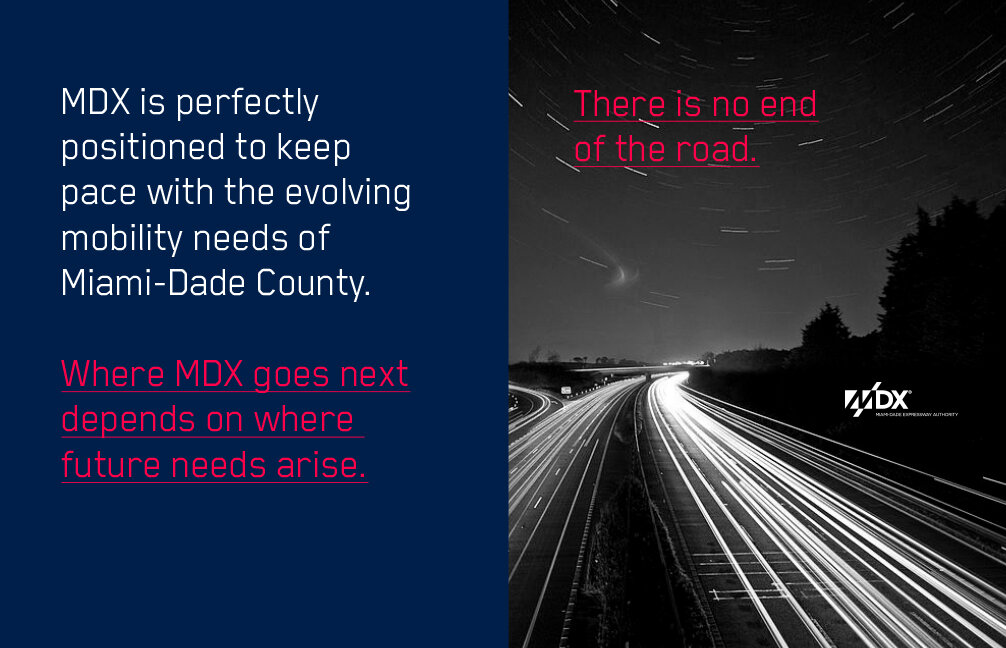
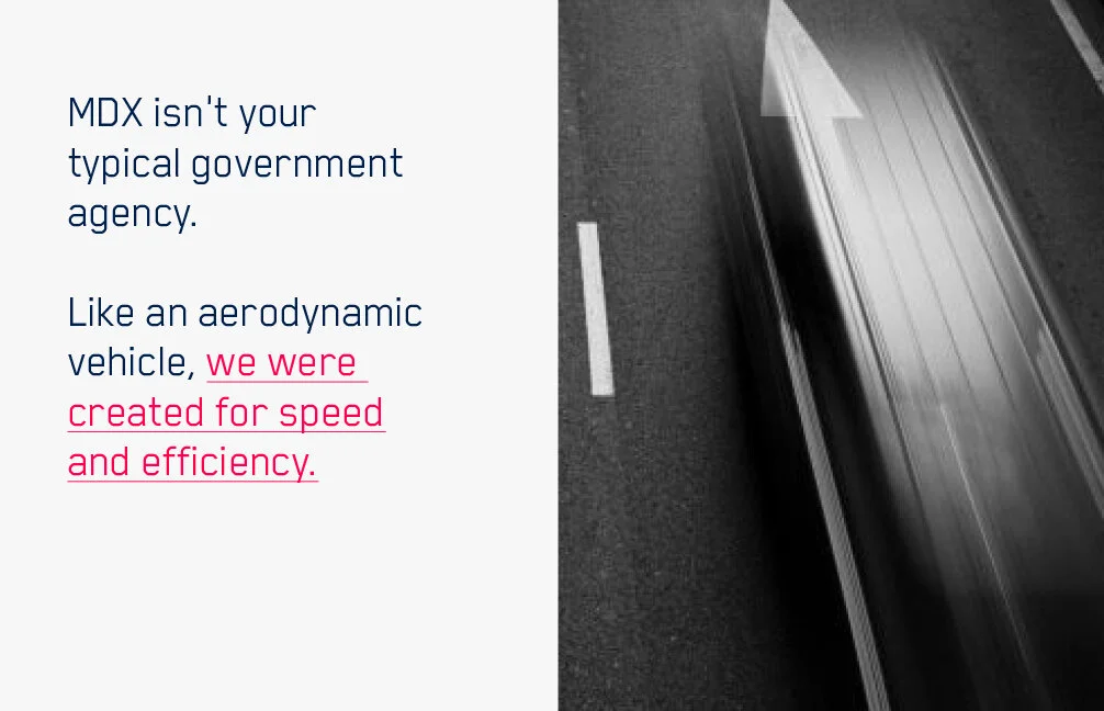
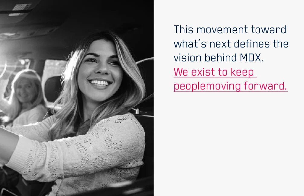
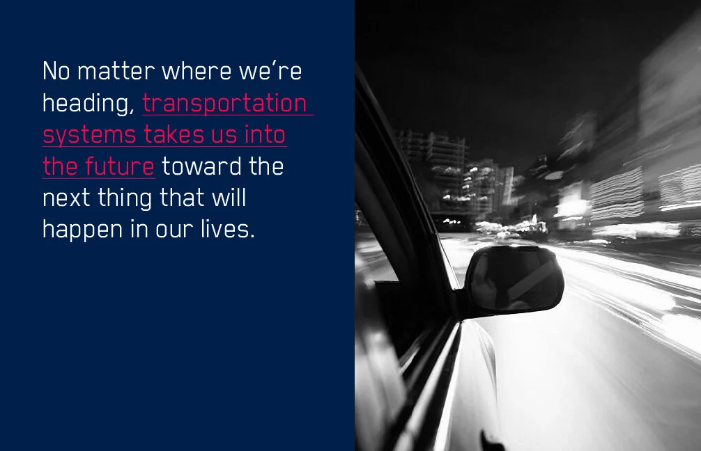
MDX is the transportation authority behind Miami-Dade County's expressway system building and maintaining the infrastructure that moves people and goods safely, affordably, and efficiently across one of the country's most complex urban corridors.
Project Goal: Develop a brand identity and communication system that could represent MDX's dual mission solving today's transportation challenges while positioning the authority as a forward-thinking leader in mobility's future. The work needed to feel both trustworthy and modern, reflecting an organization that serves millions of people across a diverse, fast-growing region.
The Story: MDX needed more than a refresh they needed a cohesive brand language that could work across every touchpoint, from large-scale environmental signage to community-facing communications. The strategy centered on building trust through clarity: clear positioning, a confident visual identity, and a communication system that could speak to a wide public audience while maintaining institutional credibility.
Made in Collaboration with Stilt Media
Strategy + Positioning + Identity + Communication + Collateral
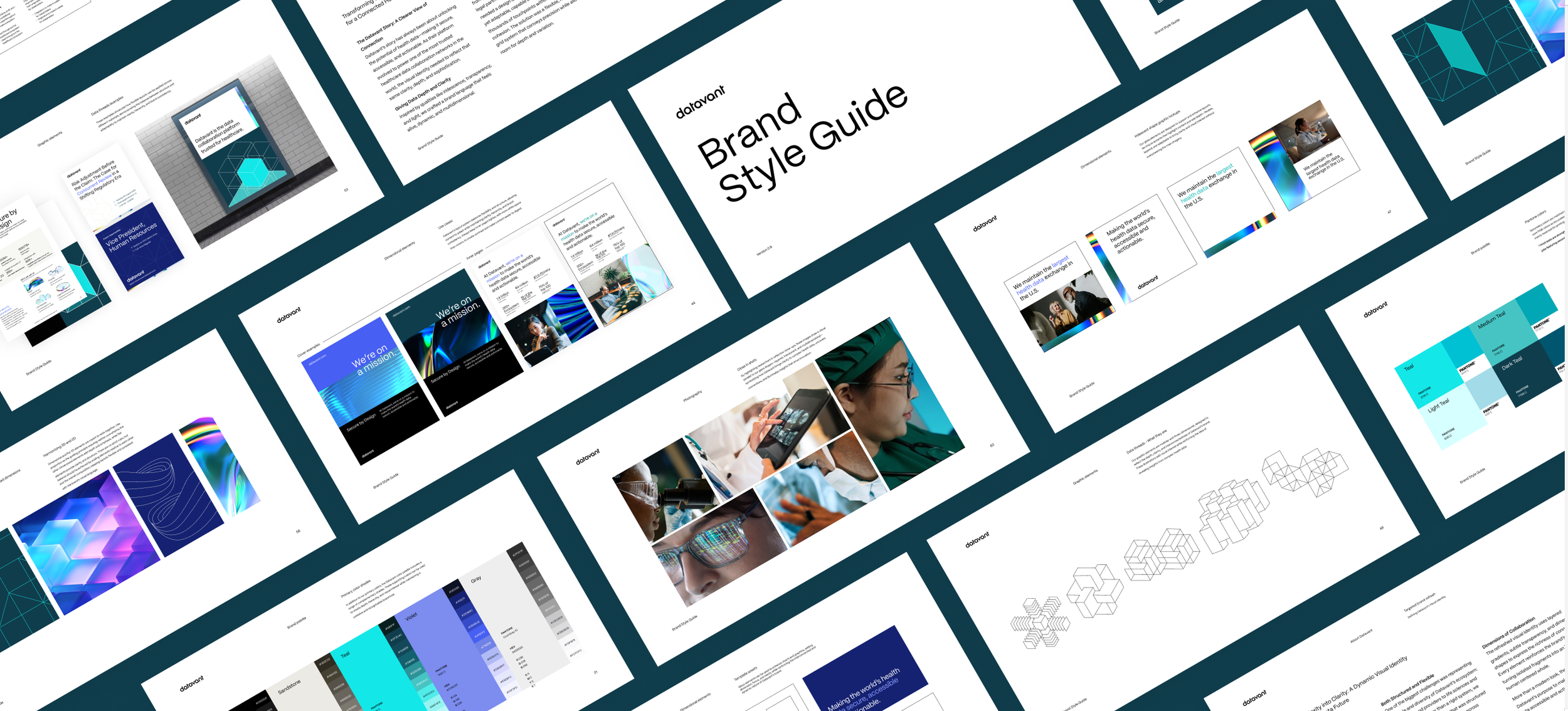
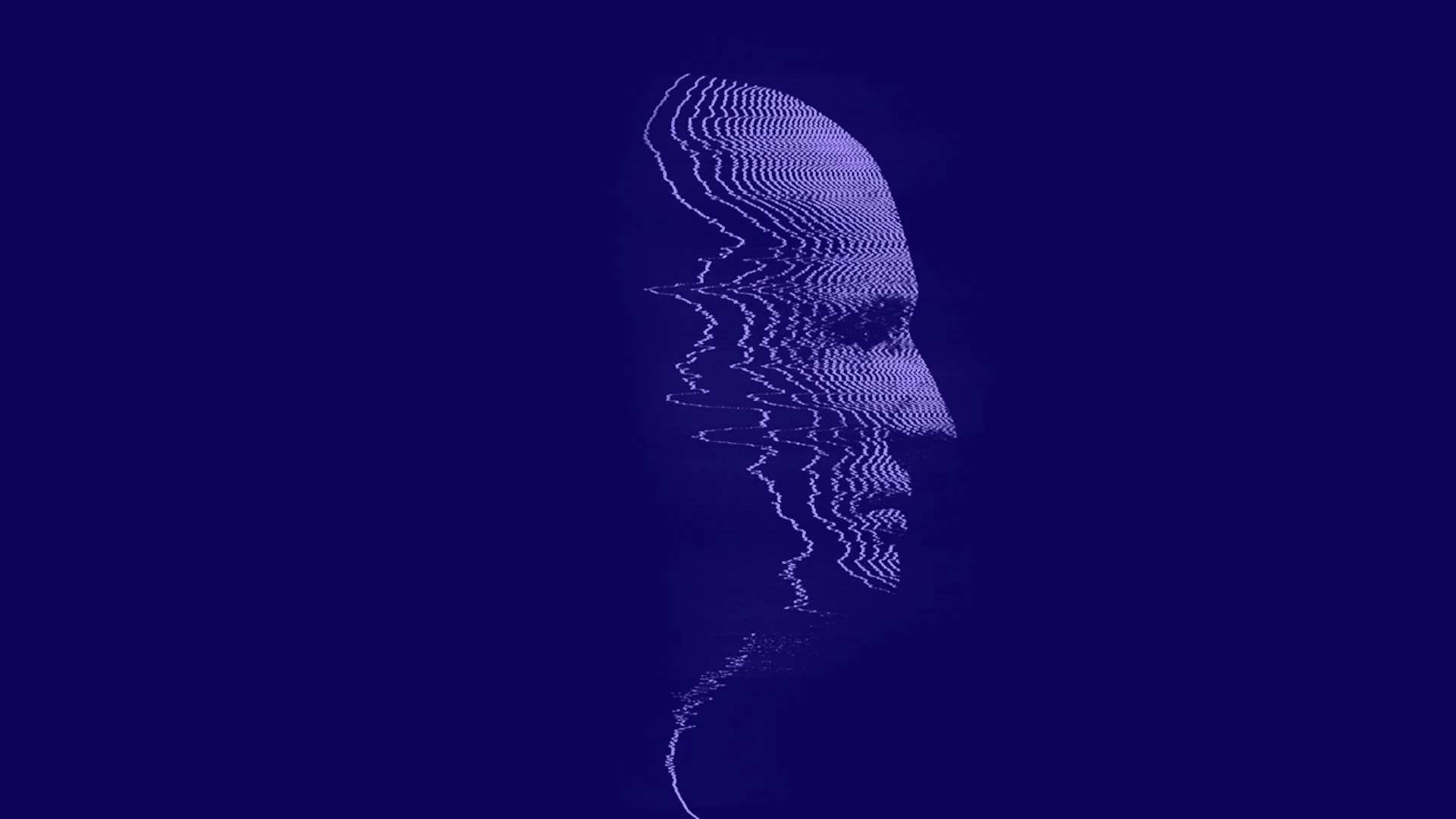
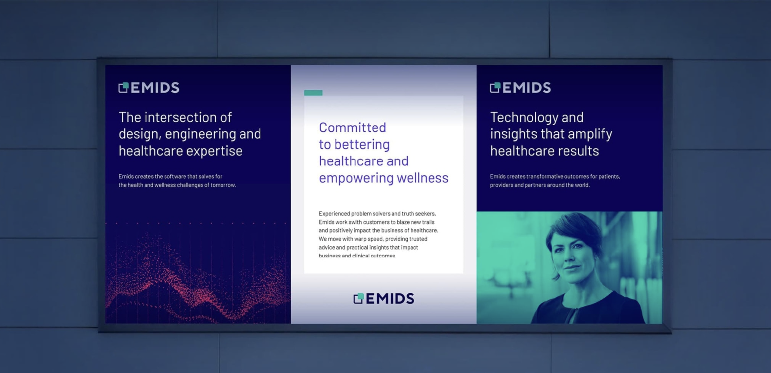
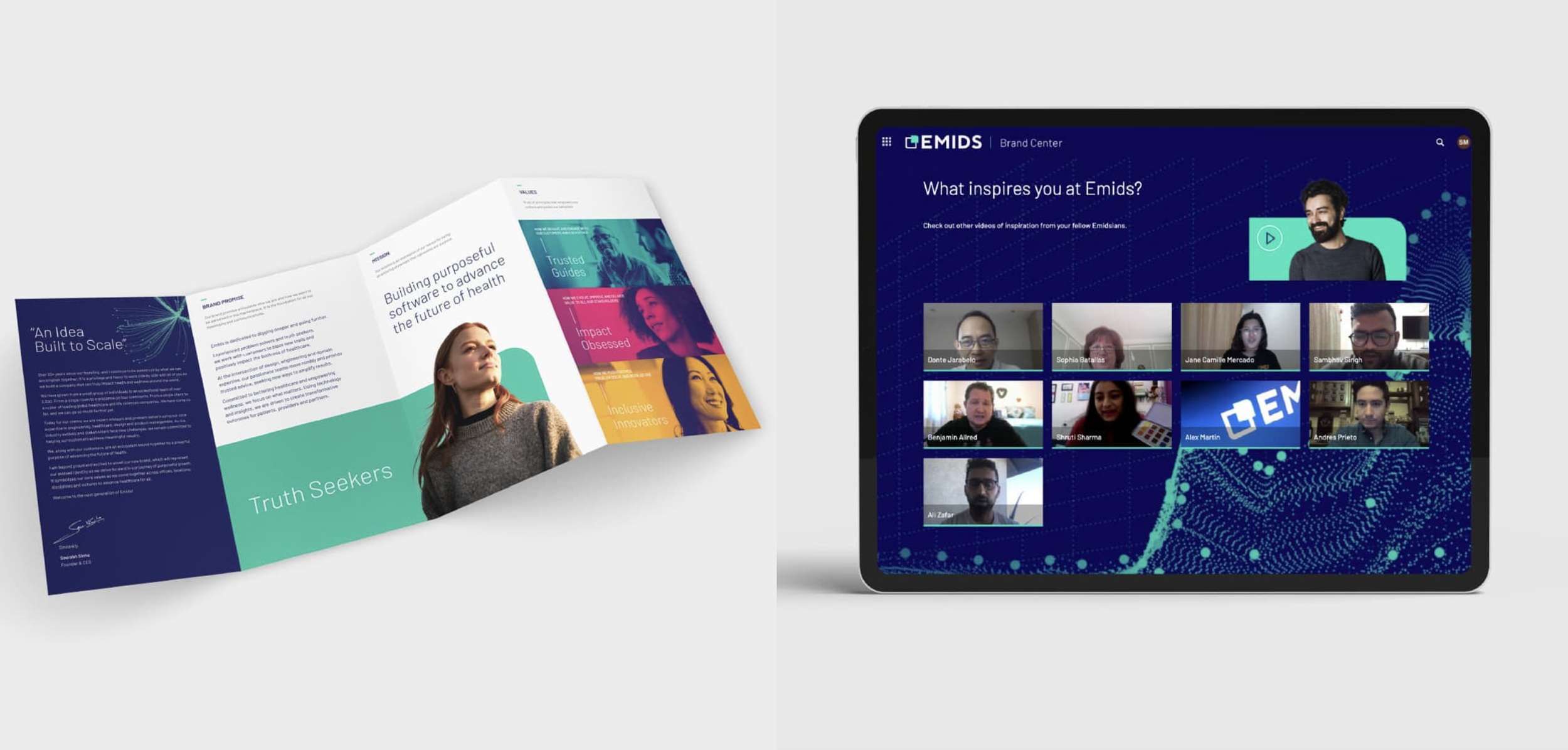
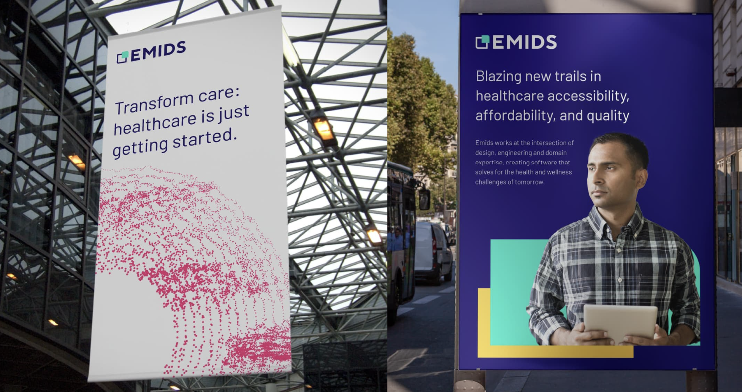
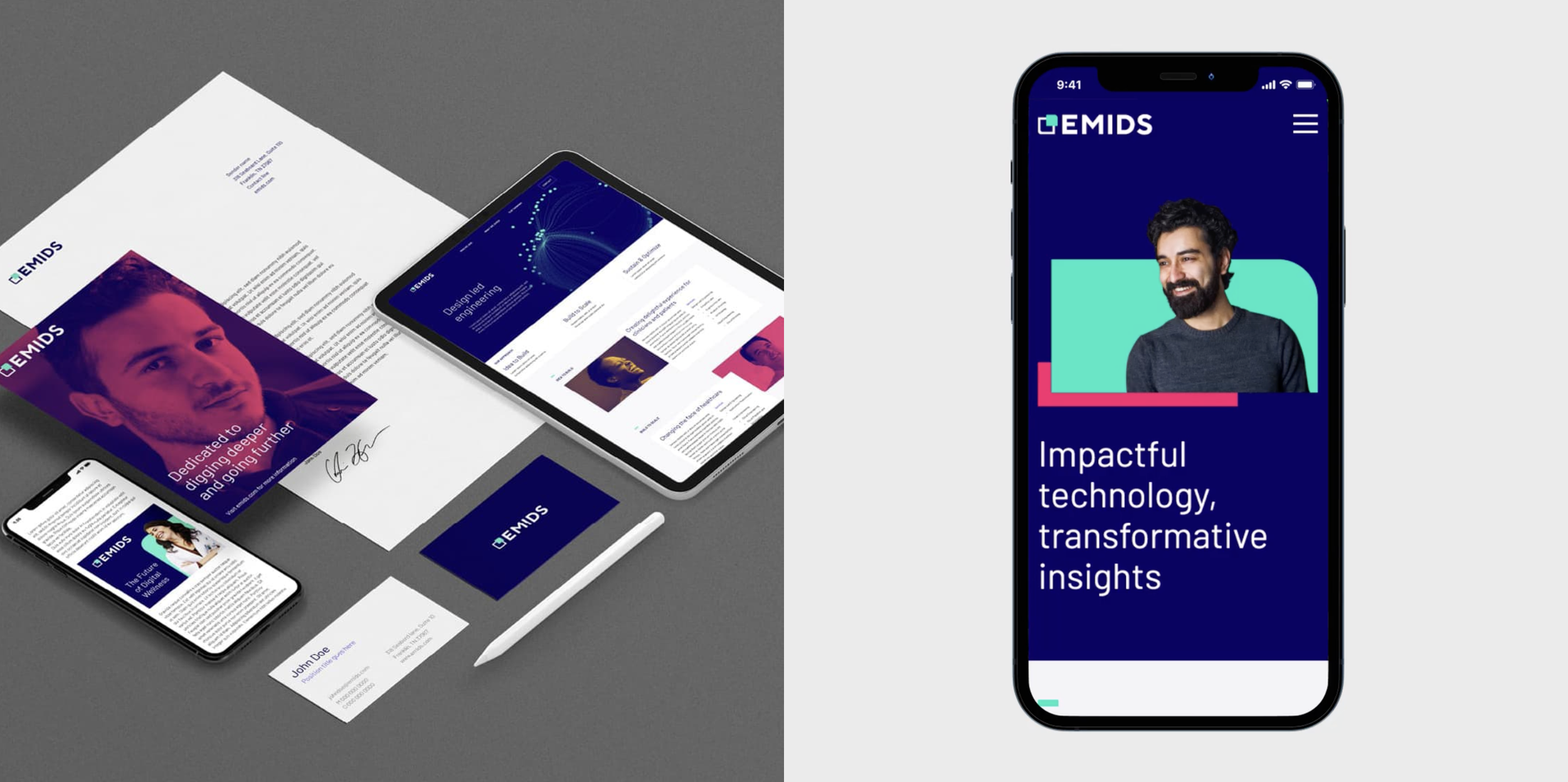
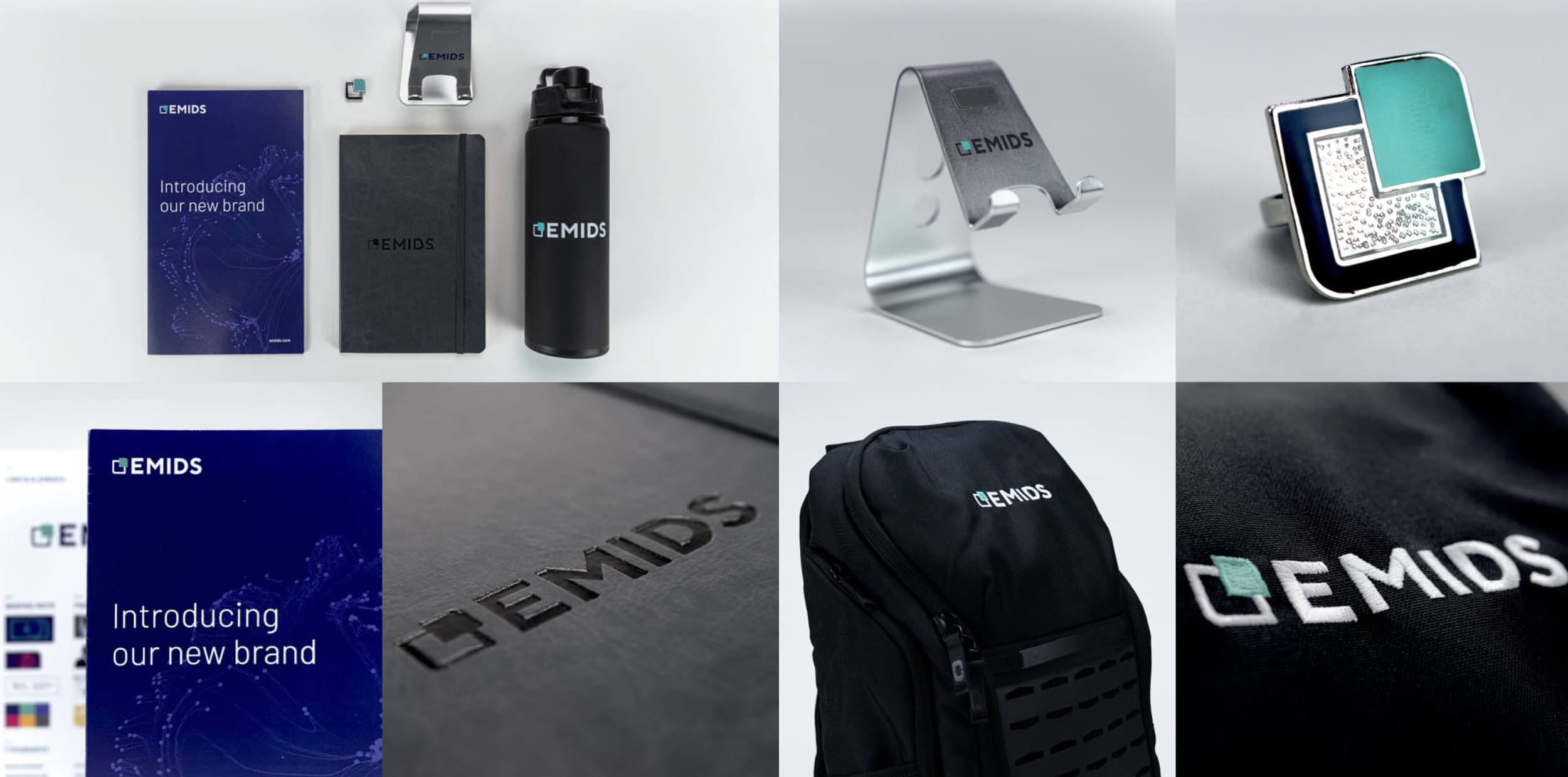
Emids is a premier healthcare software company that blends design, engineering, and deep clinical expertise to help organizations navigate complex challenges across the healthcare ecosystem. As their capabilities expanded and strategic acquisitions reshaped the business, Emids needed a brand that could keep pace one that could attract new clients, top talent, and signal where the company was headed.
Project Goal: Reassess and rebuild the Emids brand from the strategy up creating an emotionally resonant identity that could unite a growing, evolving organization under one clear and compelling vision, and launch it to the world.
The Story: The work started with purpose. A new brand commitment, mission, and principles were forged to give Emids a clear emotional foundation something teams and clients could believe in, not just recognize. From there, a dynamic visual identity and graphic framework brought that commitment to life, built to flex across global markets and every brand touchpoint. The result was a company-wide global brand launch supported by a revamped website, campaign, social media, and sustained promotional efforts that carried the new identity forward.
Made in Collaboration with MBLM
Brand Strategy + Brand Identity + Design Systems + Messaging + Campaign + Social Media + Brand Launch + Presentations + Events & Environments + BrandOS
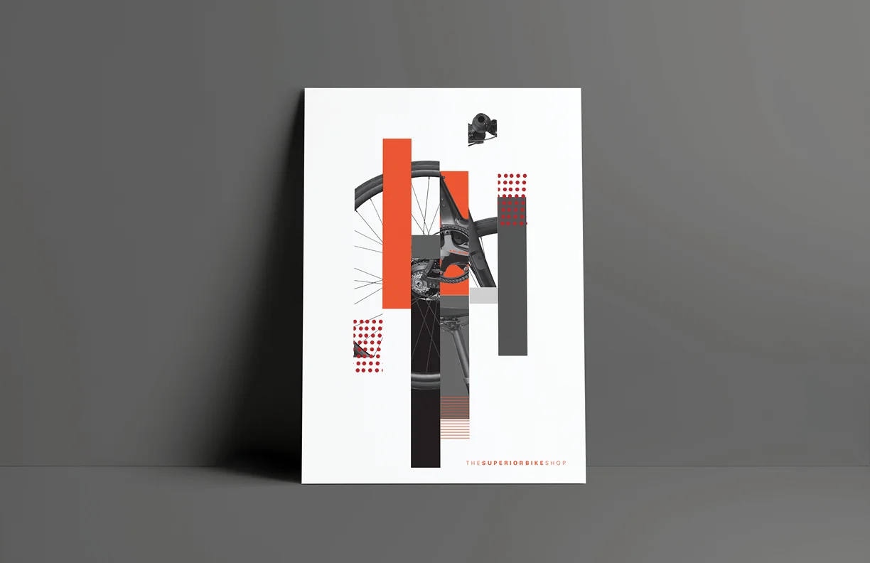
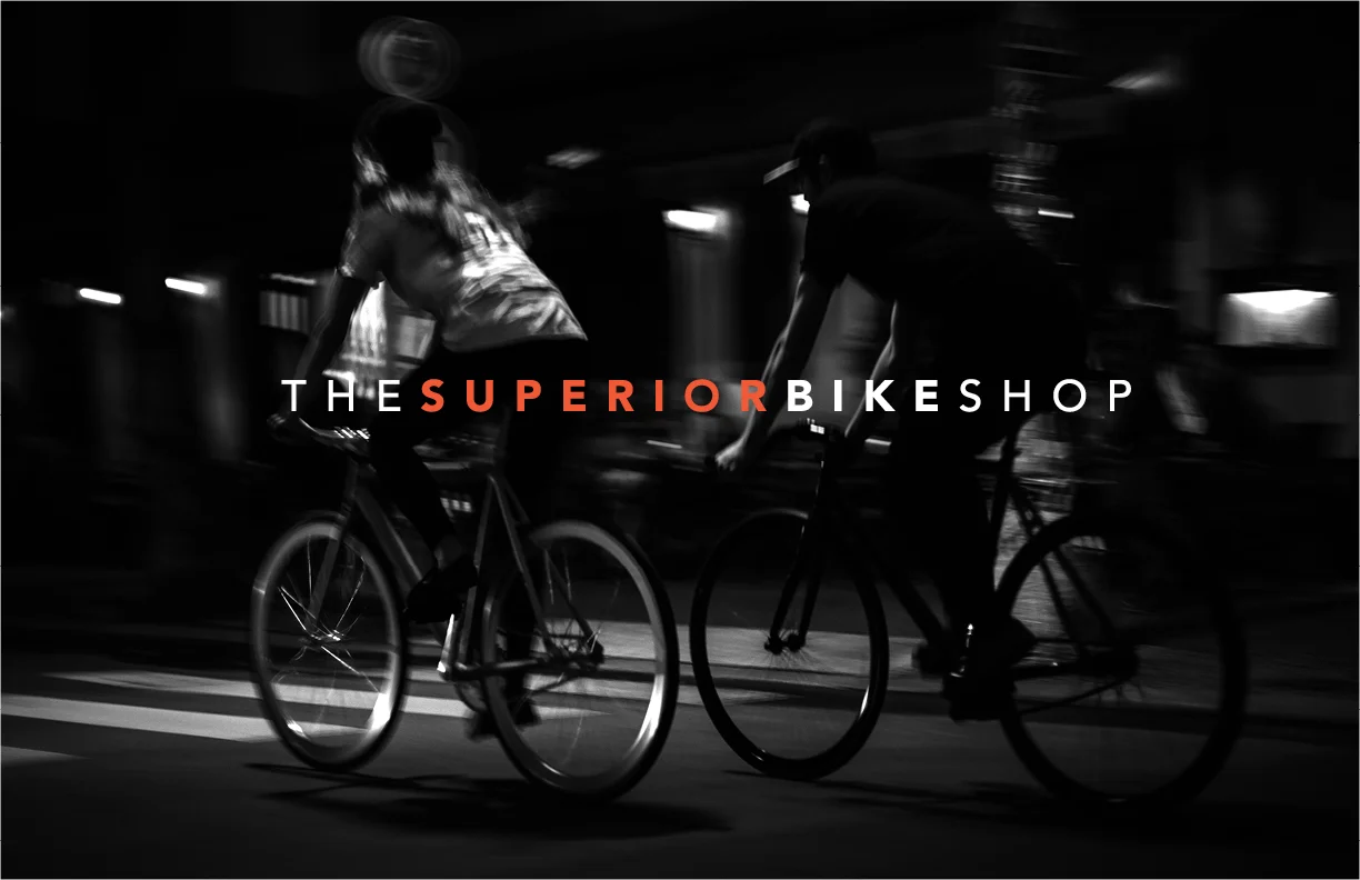
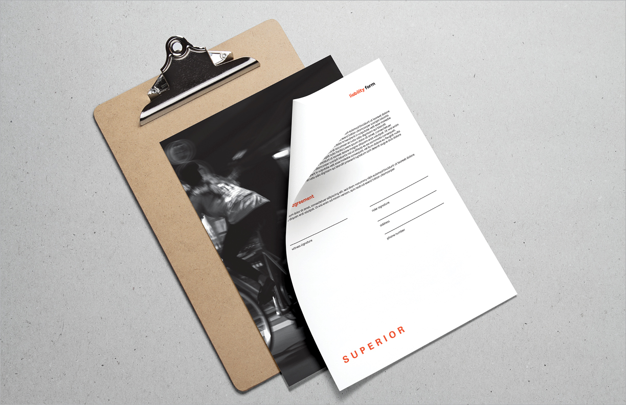
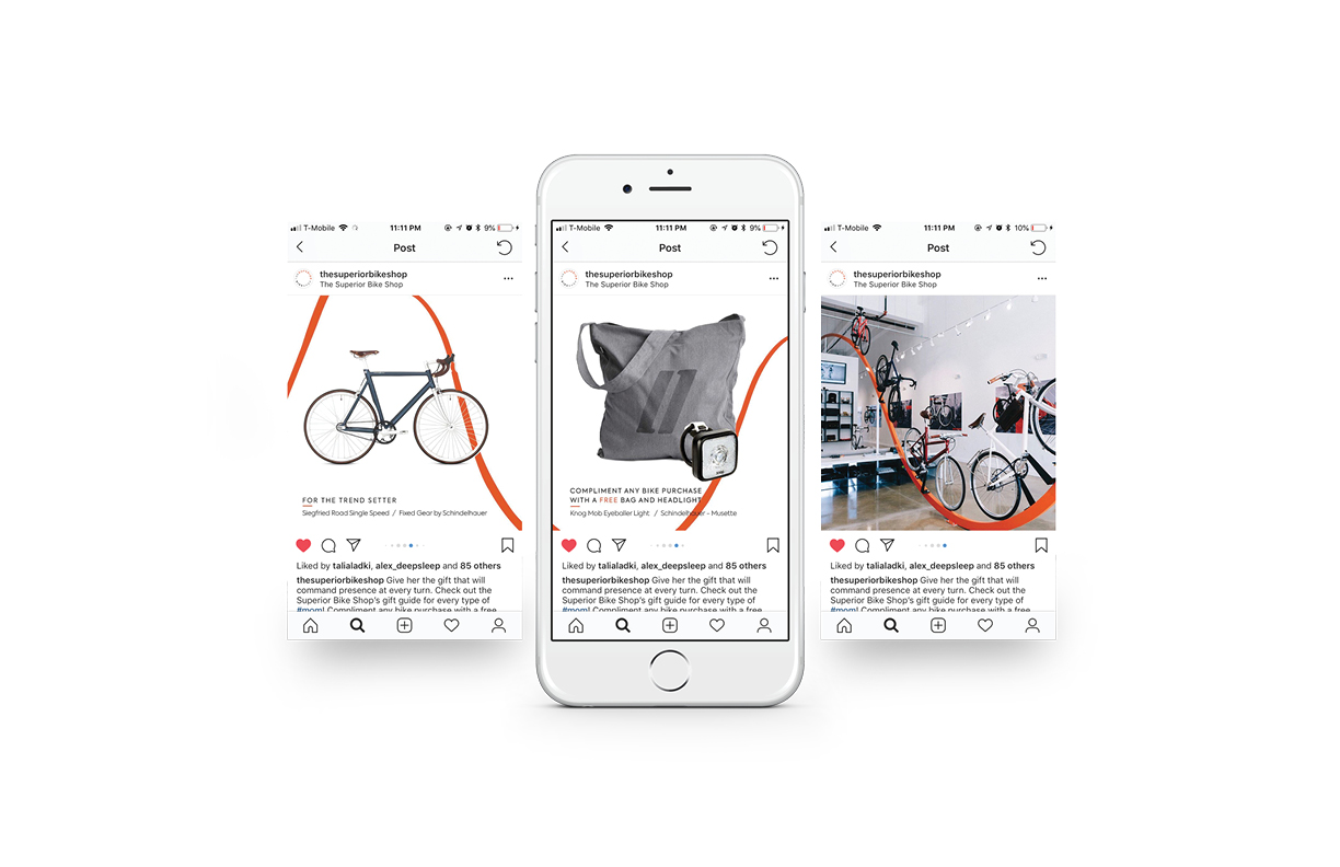
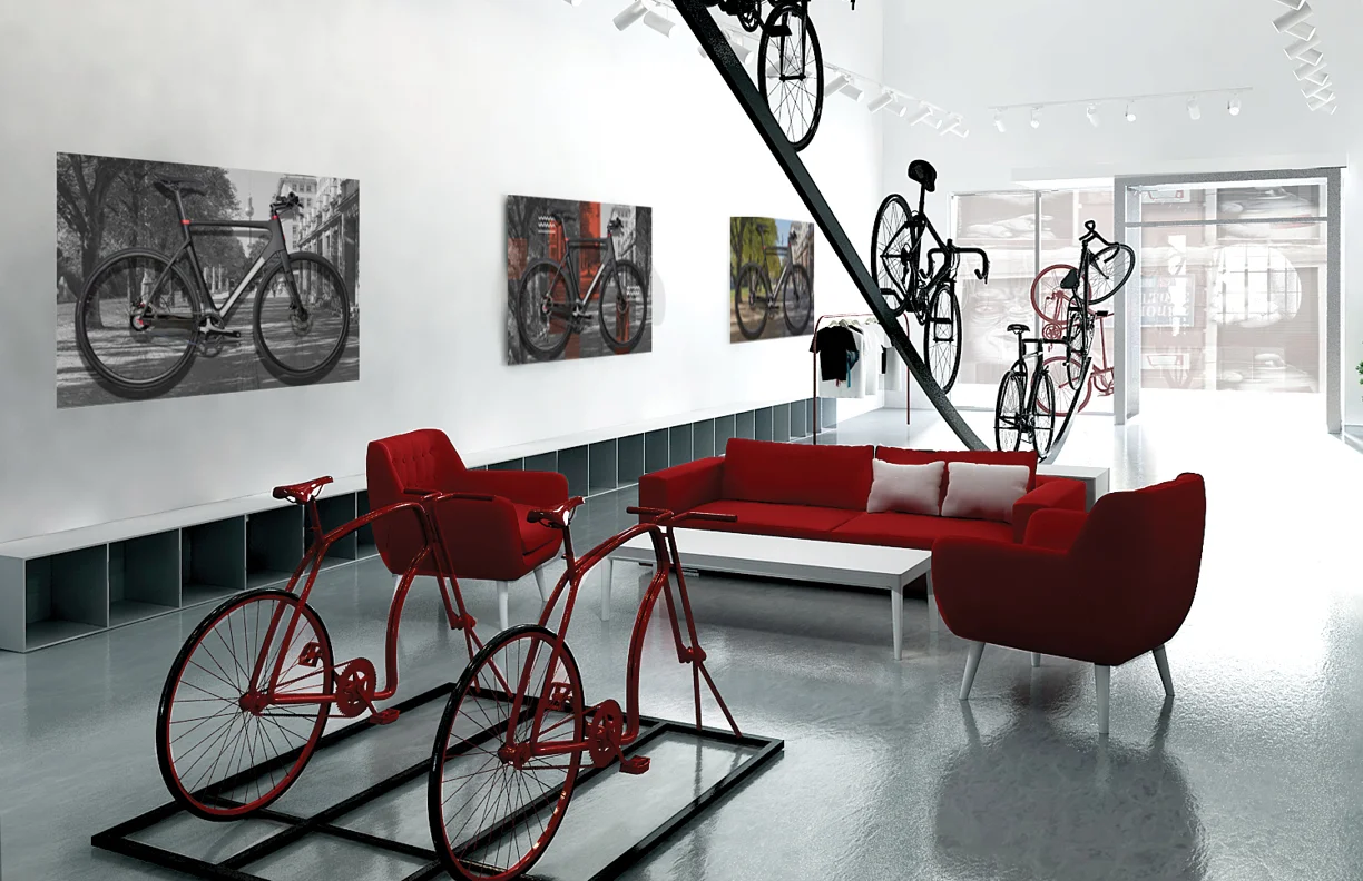
The German bike shop that takes the turn on urban bike riding. Pushing the common commute with riding toward a fit for every rider. Providing A wide range of high quality bikes that fits casual, professional and commuters. The Superior Bike Shop brought its common European brands to Miami’s Wynwood District to expand to neighborhood cyclist.
Made in collaboration with Deepsleep Studio
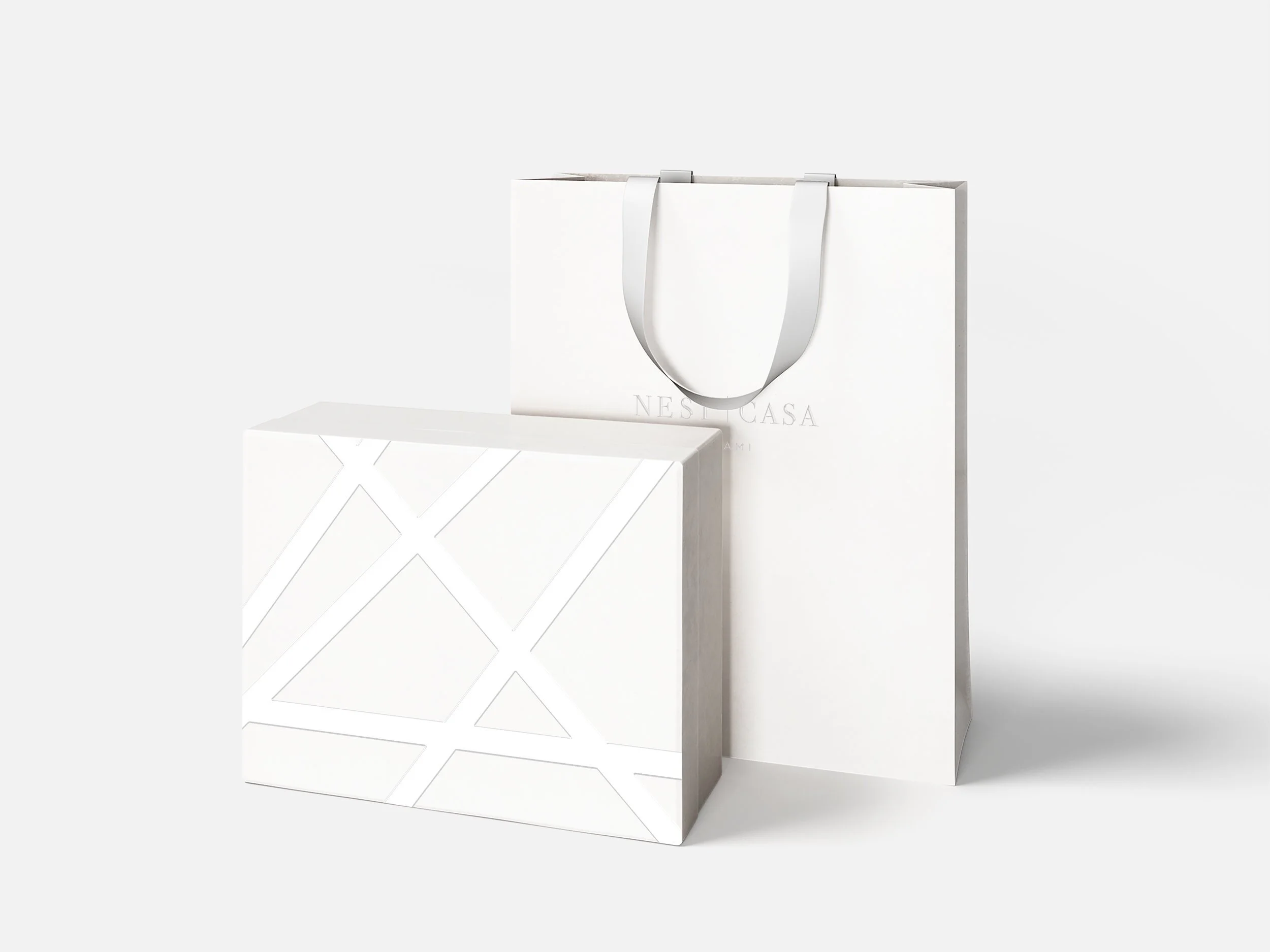
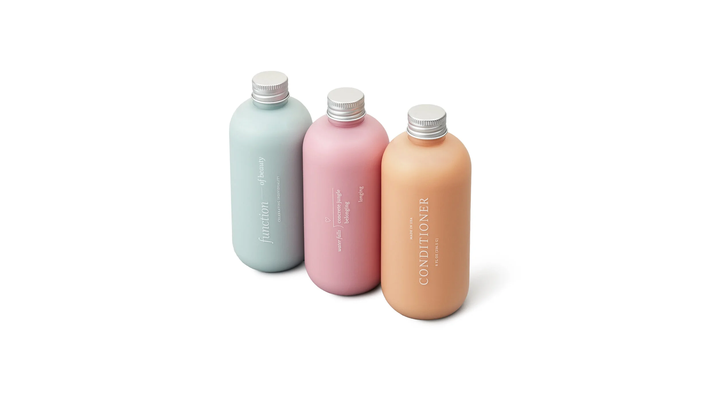
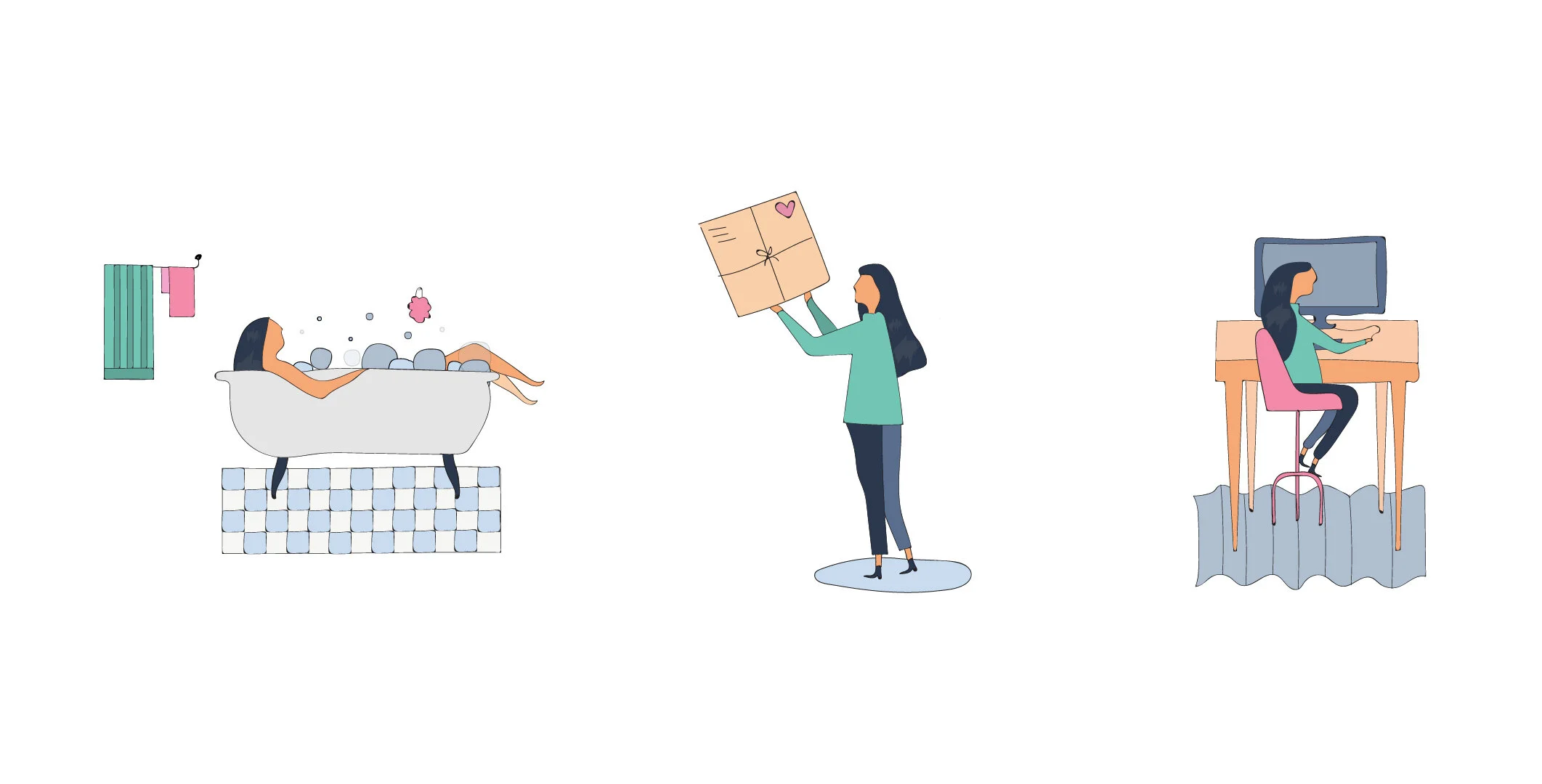
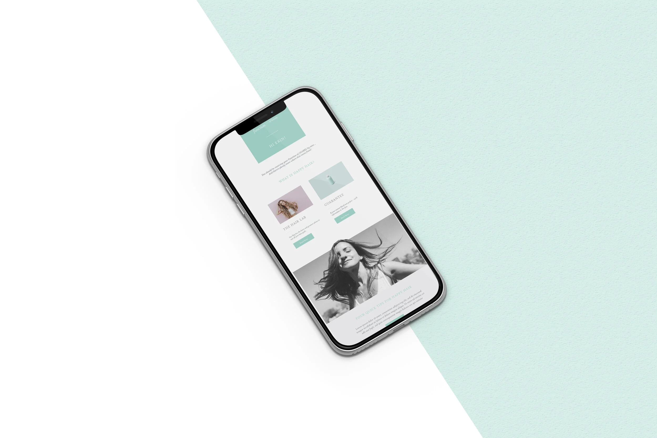
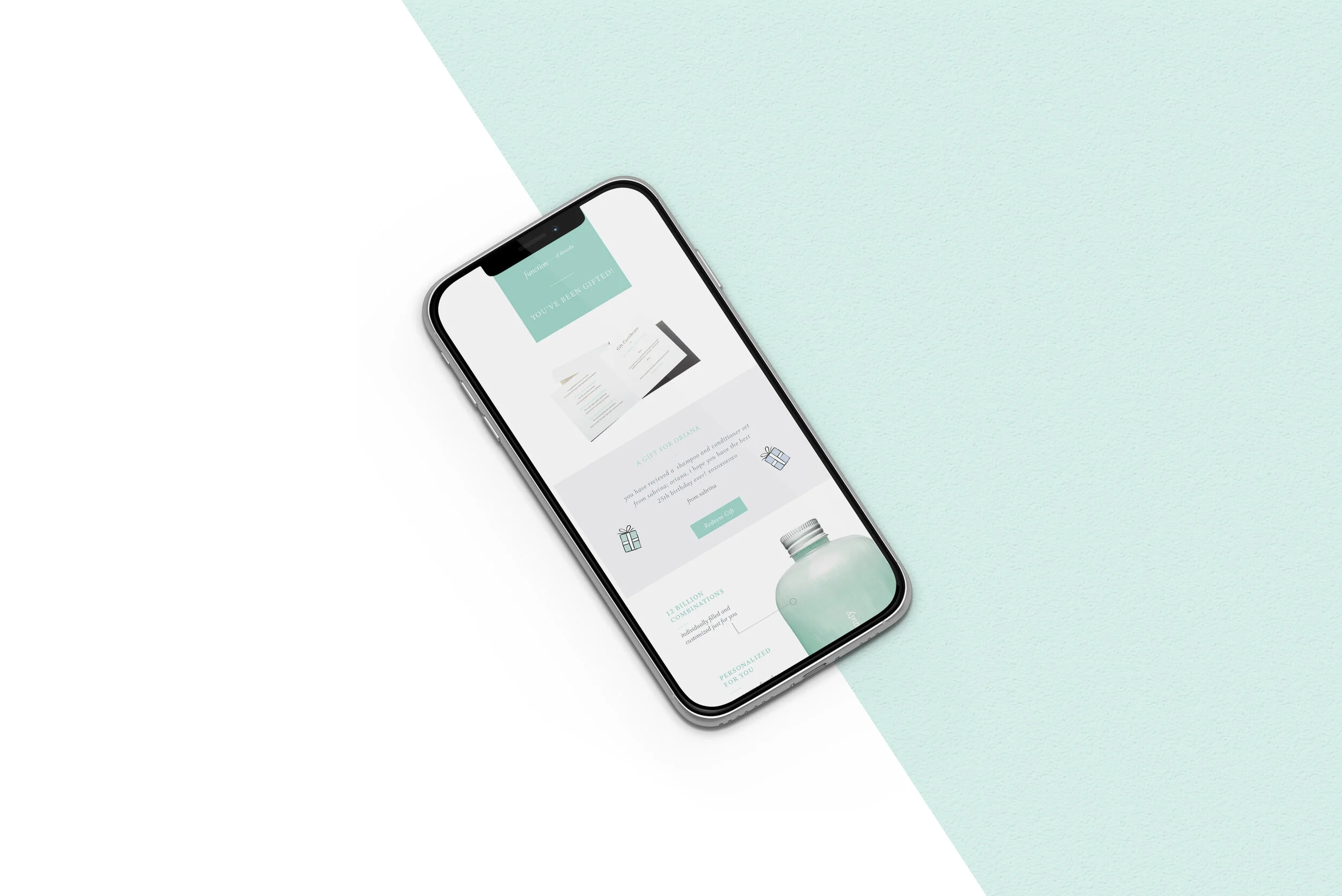
Function of Beauty is a well known hair care that personalizes the ingredients to your specific needs. The project goal was to create email graphics and illustrations for the on going needs.
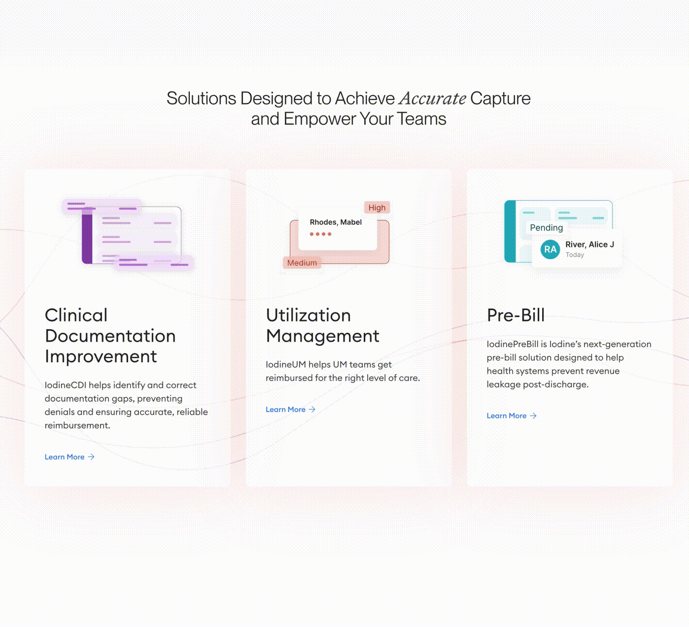
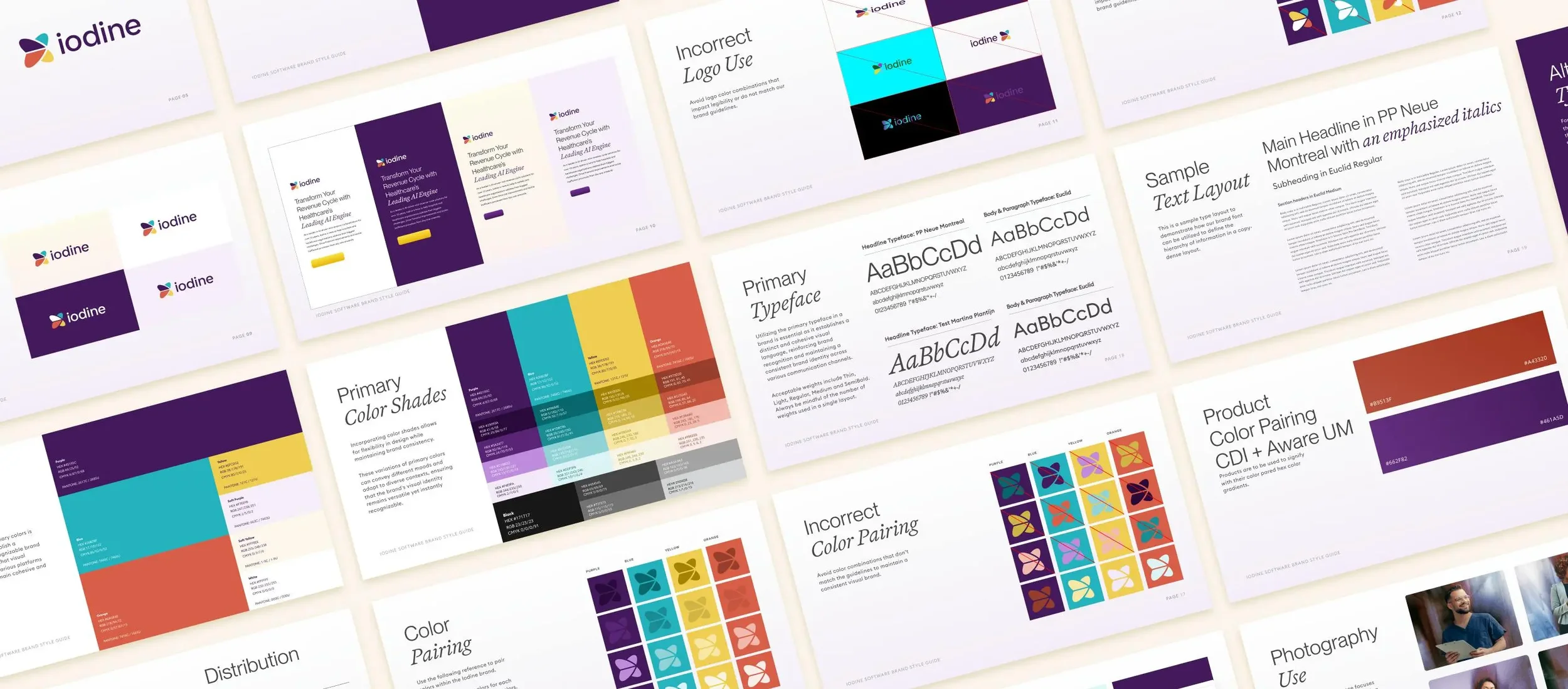
Iodine Software is a pioneer in AI-powered clinical documentation integrity, helping health systems capture, interpret, and act on clinical data. As AI flooded the healthcare market with similar-sounding claims, Iodine's story risked getting lost in the noise.
Project Goal: Evolve the visual identity and rebuild the website to reclaim Iodine's position as the trusted leader in clinical AI, with a sharper, more confident story.
The Story: Iodine didn't need to start over. They needed to grow into what they'd already become. We modernized the brand's visual language while preserving what made them distinct, and rebuilt the website to give their team a flexible, scalable platform. Within six months, organic search became one of their strongest channels for high-intent traffic. The following year, Iodine was acquired by Waystar in a $1.2 billion transaction.
Made in Collaboration with Atomic Health
Visual Identity System + Website Design + Website Development + SEO